ArinaScharff
Creative Director. I turn brand ideas and cultural moments into campaigns people notice, from the first insight to every touchpoint.
Enter the work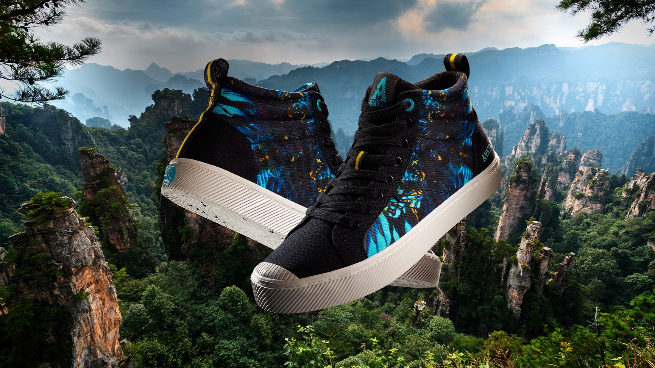
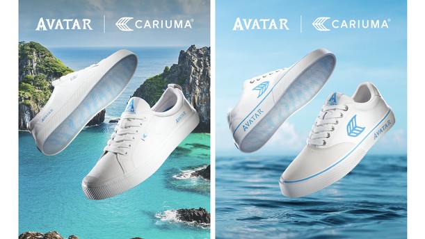
Avatar: The Way of Water
Worlds within worlds: designing Pandora for your feet.
Snapshot
- Client
- Cariuma
- Licence
- Avatar: The Way of Water
- Category
- Footwear, limited-edition capsule
- Season
- FW 2023
- My role
- Creative Director: storytelling, visual direction, product narrative
- Owned
- World translation · Product design · Campaign direction
- Partners
- James Cameron’s team · Cariuma marketing · Photography · Press
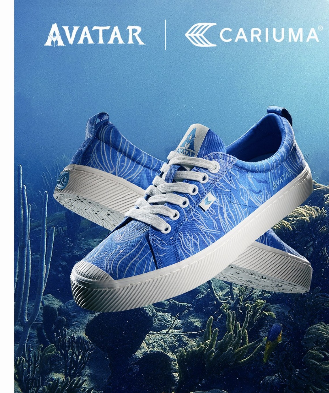
Worlds within worlds: creating Pandora for your feet.
Bringing a cinematic universe into everyday life, transforming Pandora’s emotional world into a wearable experience.
World translation
Distil breathtaking, otherworldly visuals into wearable detail.
Fantasy vs function
Cinematic enough for fans, commercial enough for a shelf.
Three audiences
Fans, children and parents, each wanting a different thing from the same shoe.
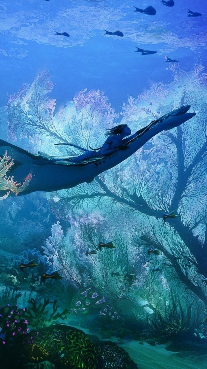
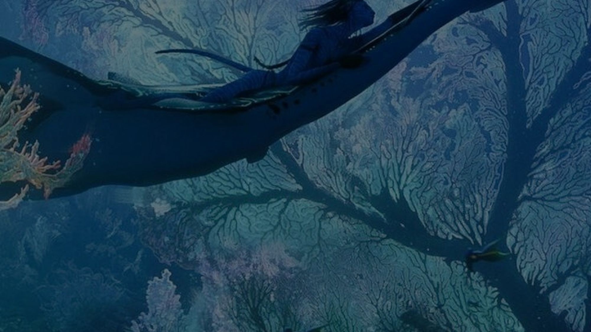
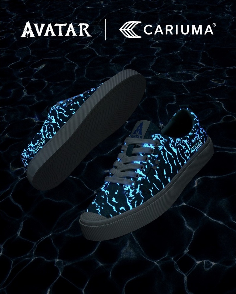
The shoe changes
when the lights go out.
Bioluminescence · Wonder · Sustainability
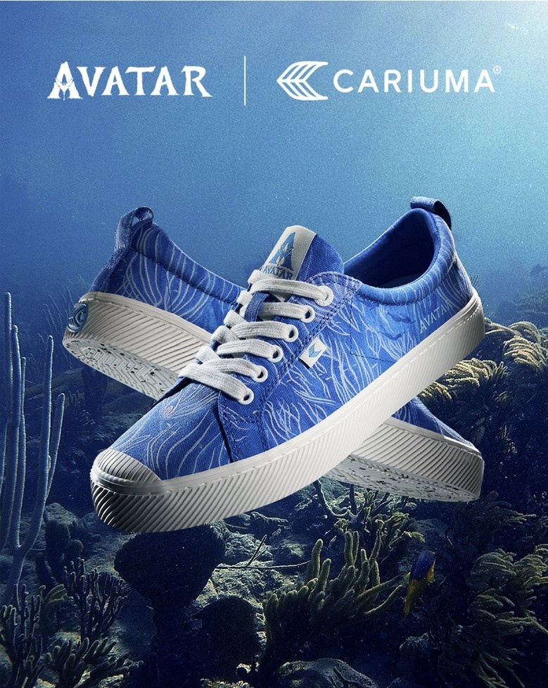
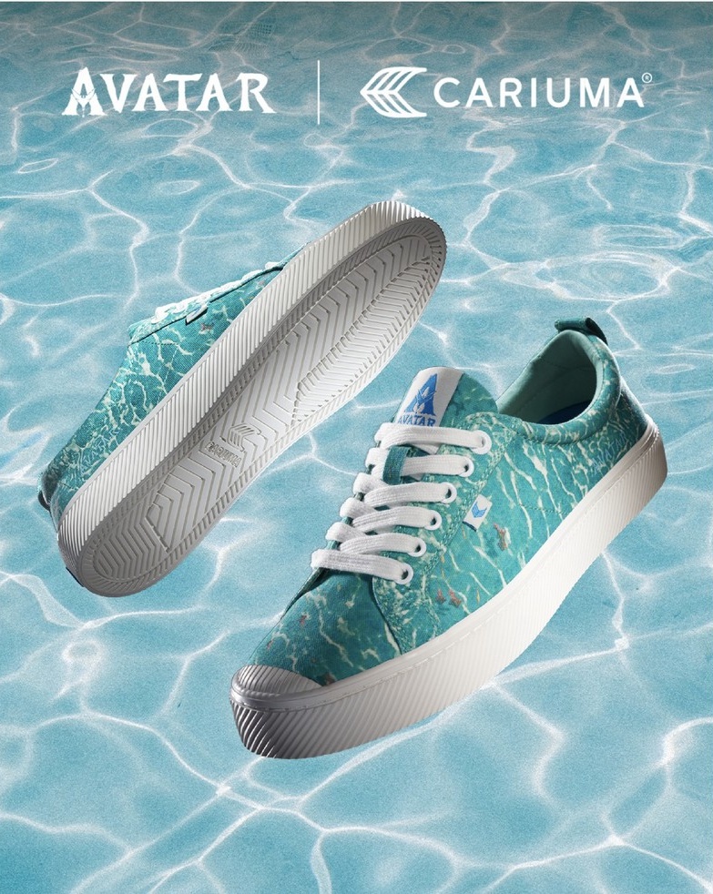
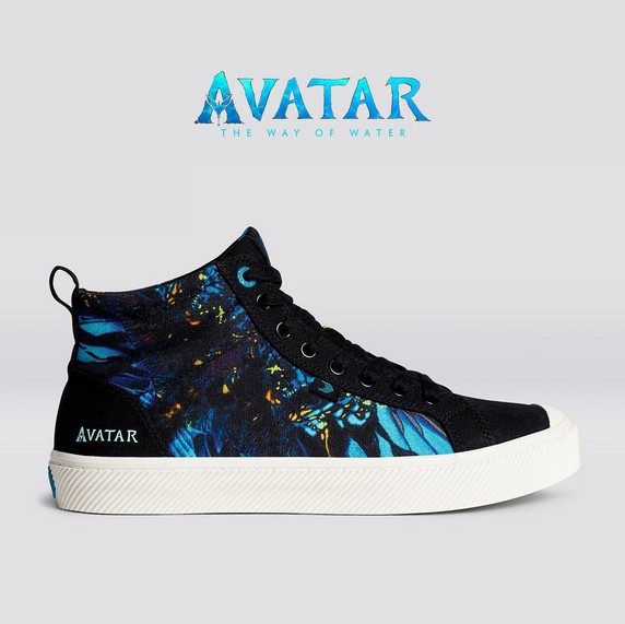
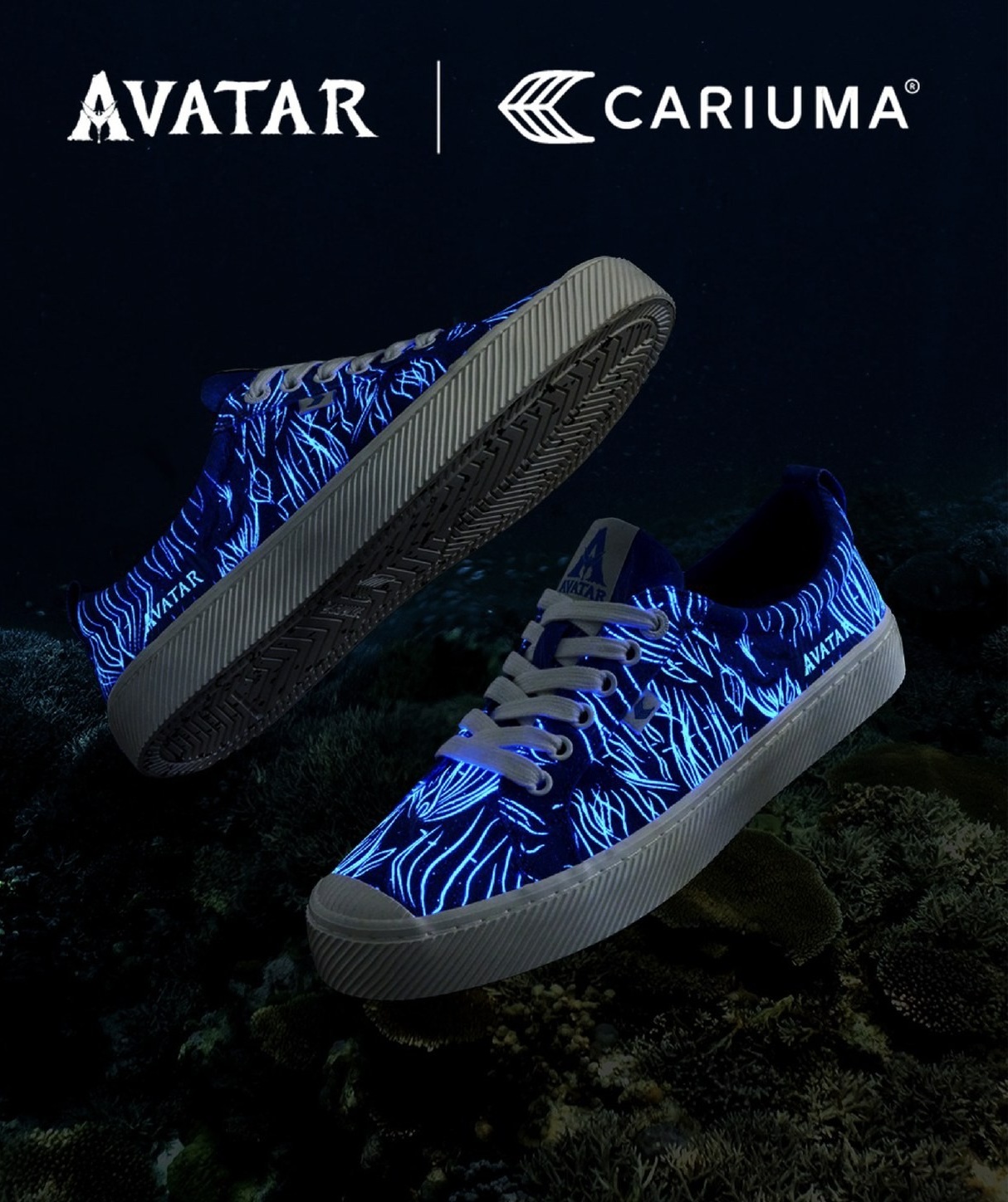
Two states, one shoe
Reef and water pattern, readable as graphic print.
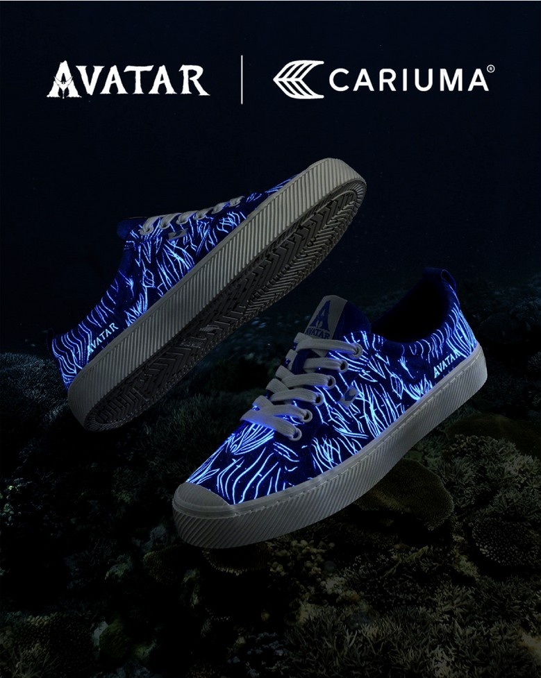
Special effect
The same artwork resolving into bioluminescence.
Glow-in-the-dark elements
Reflecting Pandora’s bioluminescent underwater world.
Colour & materials
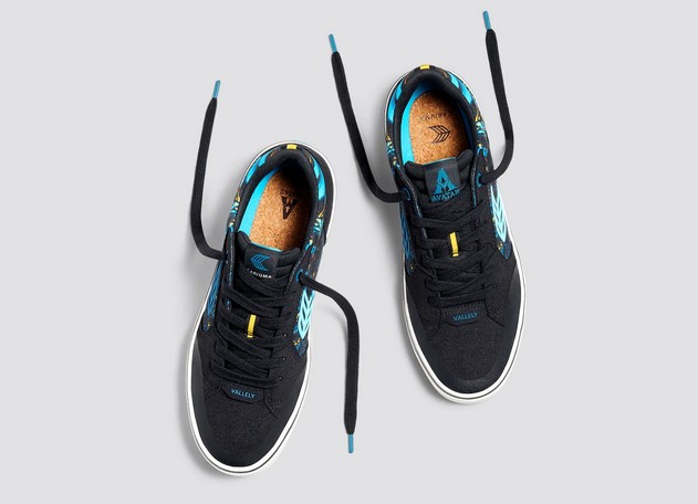
Iridescent blues, oceanic gradients and organic neutrals echoing water, light and bioluminescence.
Four stages, world to shelf
- World studyMined the films for pattern, light behaviour and creature silhouette.
- Pattern developmentBuilt prints that read as graphic by day and luminous by night.
- Materials & glowTested phosphorescent inks against Cariuma’s sustainable base materials.
- CampaignDirected photography, social and packaging around the two states.
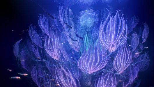
Inspiration and mood board
- Fantasy
- Beauty
- Wonder
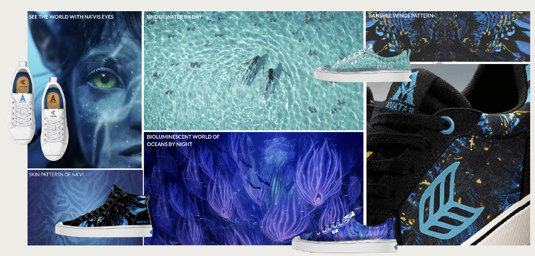
One idea, every channel
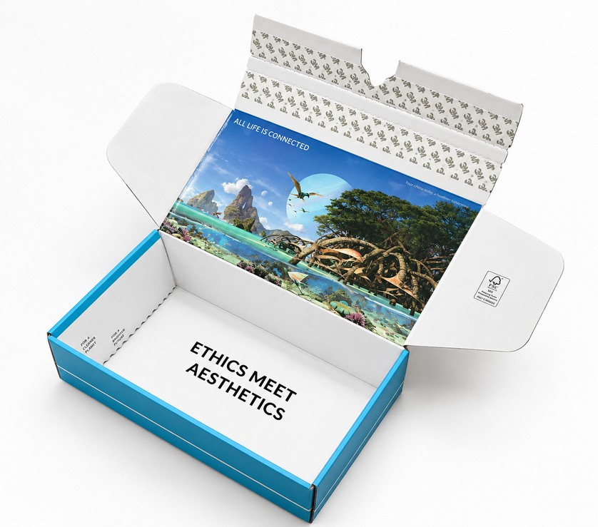
Cinematic reels built around the reveal, lifestyle imagery for texture and sustainability, packaging that stayed playful without going loud.
- Deep water
- Iridescent blue
- Bioluminescent
- Deep black
Social
Reels on process, movement and the glow reveal.
E-commerce
Tactile detail and sustainability cues.
Packaging
Playful, premium, both brands legible.
Emotional insights & campaign arc
Key message: “Design doesn’t just shape products, it shapes perception.”
Fantasy meets reality
Users felt a connection to Pandora, bridging imagination with everyday wear.
Storytelling arc
The campaign framed sneakers as vehicles for exploration, creativity and wonder: fantasy made functional.
Community engagement
Fans and consumers shared experiences online, sparking excitement, buzz and emotional resonance.
The campaign, live
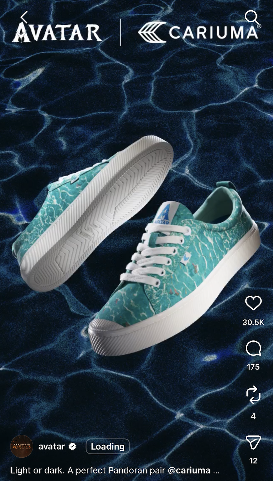
One idea held across every channel it shipped to, and beyond: the pair went on The Tonight Show, and the official Avatar account shared the reel.
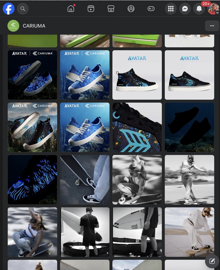
The press
A national television feature, then coverage from network morning shows through to design and lifestyle press.
What it did
National television
Featured on The Tonight Show Starring Jimmy Fallon.
Four press placements
GMA, The Daily Beast, The Quality Edit, Cariuma.
Licensed end to end
Approved with James Cameron’s team across product and campaign.
The operating picture
- Reported to
- CEO of Cariuma, Creative Director / James Cameron team
- Led directly
- 1 photographer, 2 graphic designers, 2 product designers, 1 technical designer, 2 product developers, 1 social media manager, 1 copywriter, 1 PR manager
- External partners
- Avatar II creative team, licence team, James Cameron’s creative team
- Timeline
- Brief to launch in 10 months
Why it mattered
A world people had only watched, made into something they could wear, and that quietly transformed once a day, every day, when the lights went out.
Leading it meant holding one idea steady across product design, illustration, photography, packaging and a licensor as exacting as they come, and shipping it.
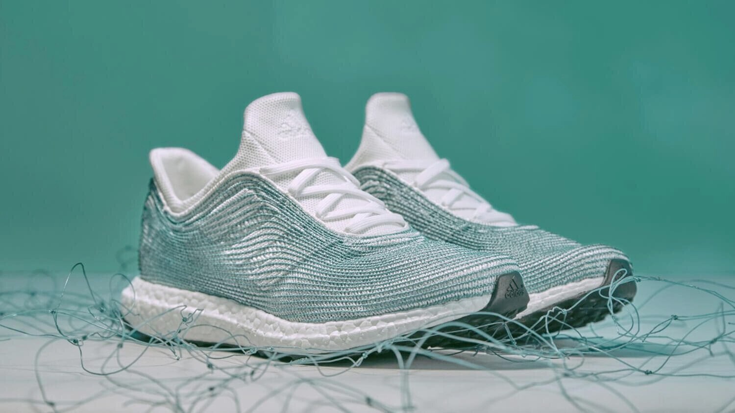
adidas × Parley
Translating brand strategy into sensory storytelling through colour, material and finish.
Snapshot
- Client
- adidas
- Programme
- Parley for the Oceans
- Discipline
- Colour, Material & Finish (CMF)
- Scope
- Seasonal collections + innovation collaboration
- My role
- Art Director: colour and material direction
- Owned
- Colour strategy · Material direction · Seasonal toolkits
- Partners
- Design · Marketing · Product · Communication
Four things to solve
Build a seasonal colour and material direction that carried a global brand theme all the way down to product, and that other teams could actually use.
Story-driven seasons
Connect global brand themes to product storytelling.
CMF strategy
Fuse innovation, sustainability and culture in one palette.
Cross-team alignment
One visual and emotional system, design through marketing.
Global toolkits
Reusable direction for product, campaign and retail.
Colour wasn’t visual.
It was language.
Emotion · Movement · Responsibility
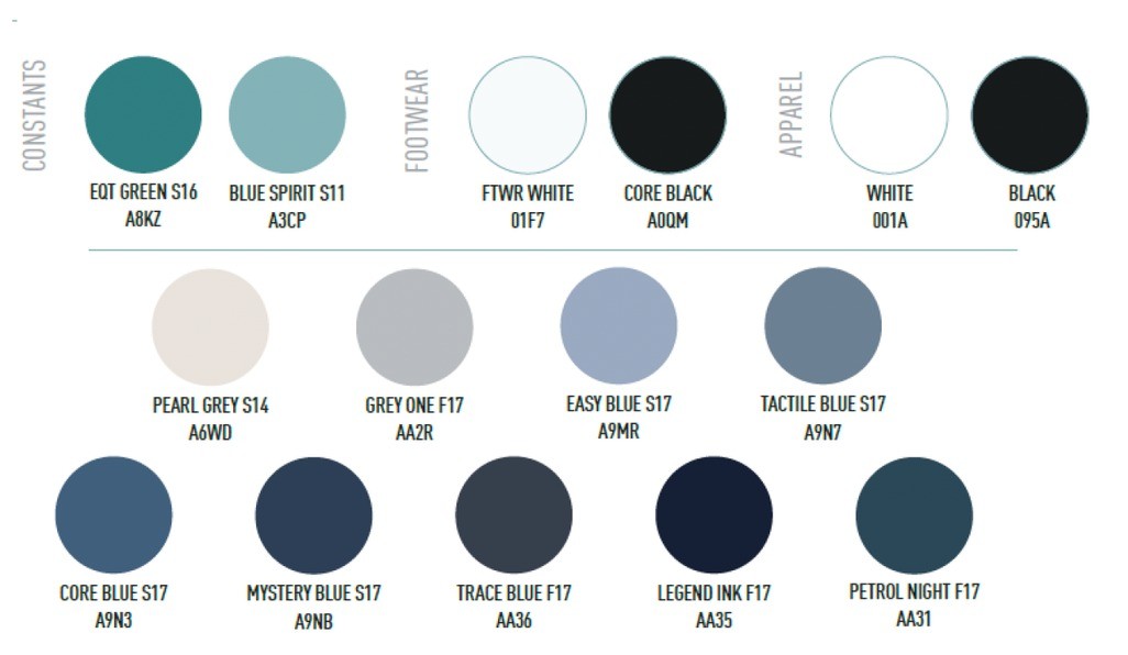
One palette, three tiers
Constants
Two anchors carried across every category so the season stayed recognisable.
Footwear & apparel
Neutrals tuned per category, because the same white reads differently in knit and in leather.
Depth range
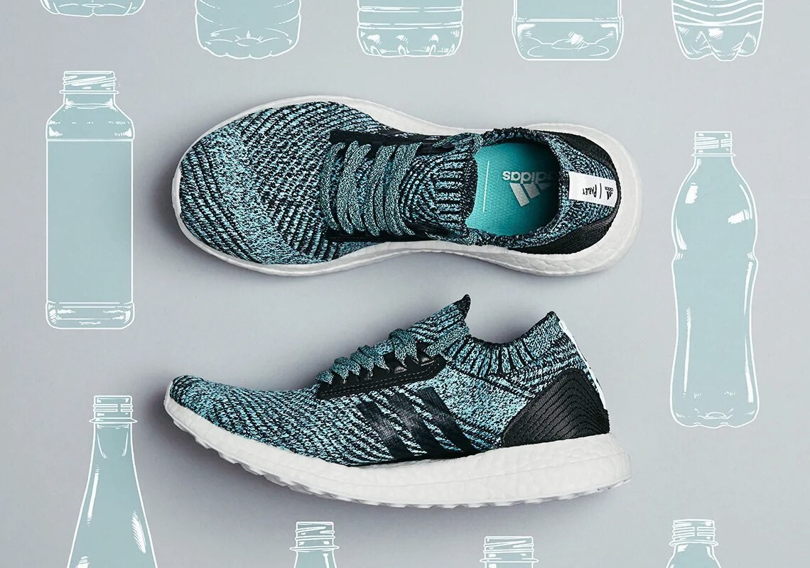
Five blues from mid-water to midnight, giving designers range without drift.
Where the colour came from
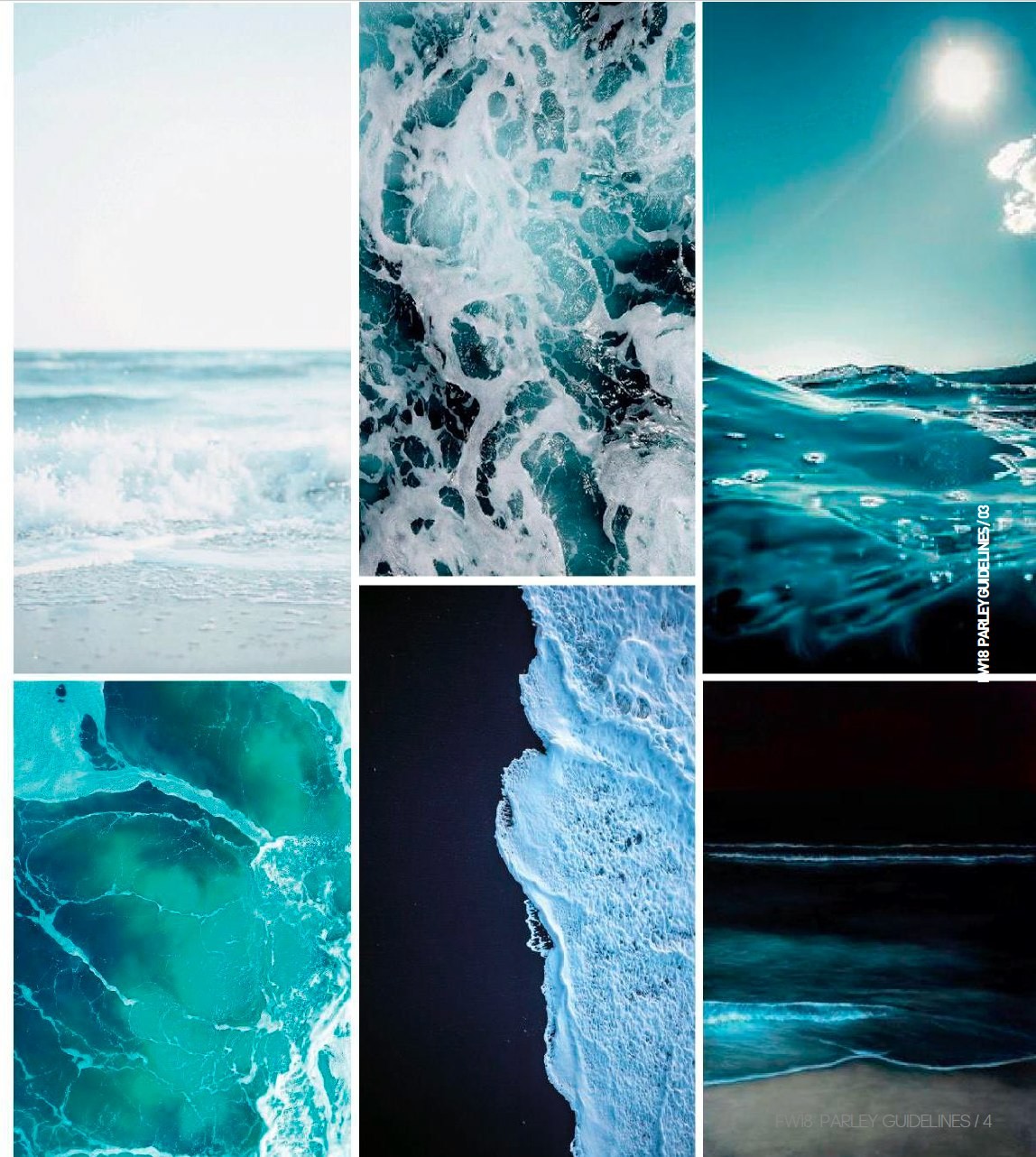
Ocean gradients drawn from shifting light under water. The palette had to work as a range, not a set of favourites: every shade needed a neighbour it could sit beside on a shelf.
Studied
Surface light, breaking foam, deep water, night ocean, shoreline, submerged edge.
Material storytelling
Textures referencing reclaimed fibre and wave pattern, a tactile reminder of what the shoe is made from.
Visual narrative
Every product carried the emotional trace of water: calm, and still powerful.
Palette to shelf, without drift
- Material paletteColour defined against the actual recycled yarn, not on screen.
- ProductApplied per category, with constants holding the season together.
- CampaignPhotography and graphic direction keyed to the same blues.
- RetailIn-store and packaging closing the loop on the story.
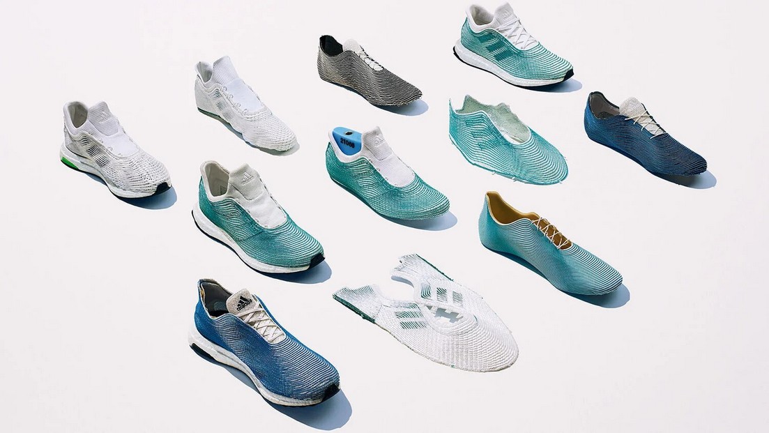
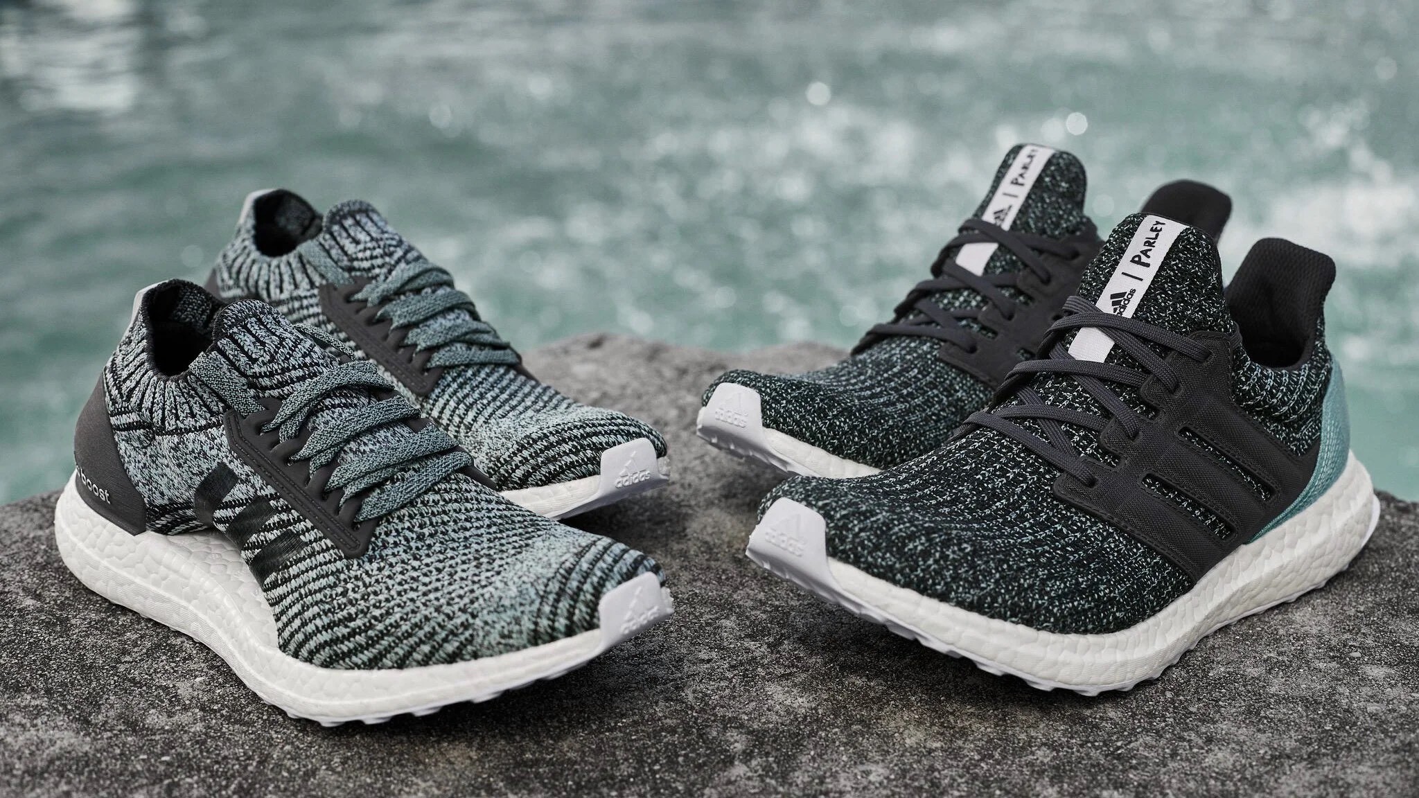
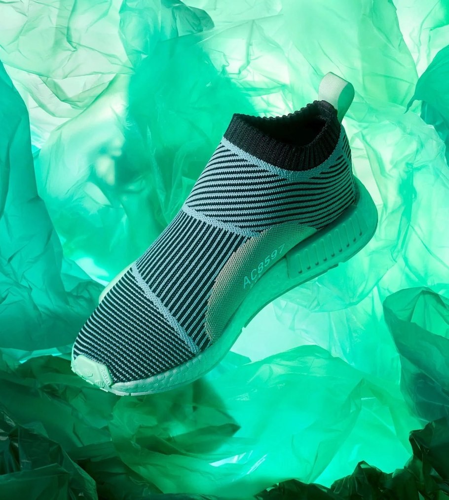
One story across every category
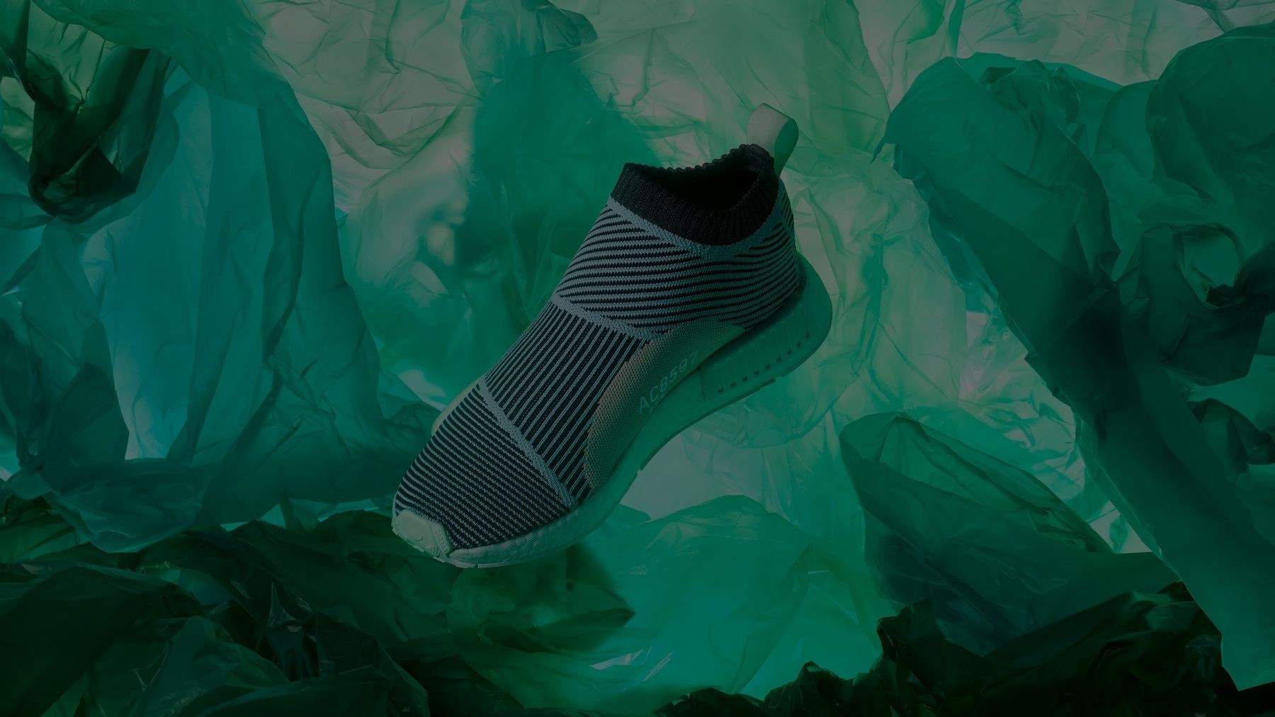
Parley footwear range carrying the season’s colour architecture.
What it did
Became the global reference
The palette was adopted as the standard for ocean-inspired design.
Internal benchmark
Recognised as the reference for future eco products in sport and fashion.
Defined the blueprint
Set how sustainability was told visually inside adidas.
The operating picture
- Reported to
- Creative Design Director Product, Creative Design Director CMF
- Led directly
- 2 CMF designers, 1 materials developer
- Worked across
- Design, Marketing, Product, Retail, CMF creative team
- Timeline
- A seasonal programme over 2 years
Why it mattered
Plastic pulled from the ocean, turned into something people chose to wear: sustainability sold through beauty rather than sacrifice.
Leading it meant holding one colour story steady across categories, markets and teams, and making it usable by people I would never meet.
IBI
A new generation of sustainable footwear, and a campaign that made sustainability feel like the easy choice.
Snapshot
- Client
- Cariuma
- Product
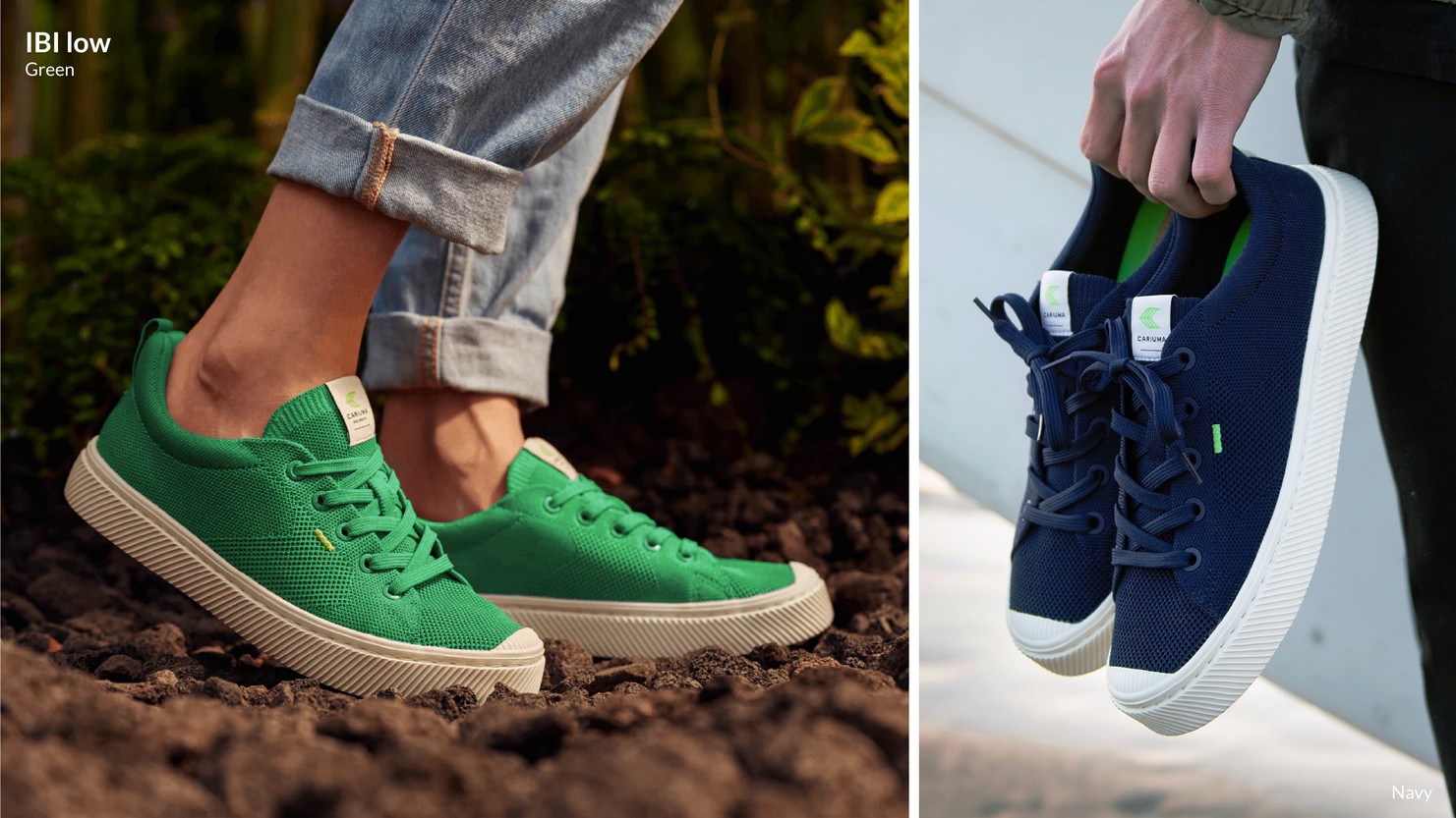
- IBI: bamboo knit, carbon neutral
- Category
- Footwear launch + full campaign
- My role
- Creative Director: concept, art direction, product storytelling
- Also led
- Photography lead · video lead
- Delivered
- Visual world · 3 campaign films · full asset system
- Channels
- Social · e-commerce · retail · print · packaging
Something people want
IBI introduced a genuinely new material language to footwear. The problem was that innovation this technical usually gets explained, and explanation kills desire.
The question
How do you make sustainability something people want, not something they feel they ought to care about?
The reframe
Rather than the problems facing the planet, we led with the possibility. Vegan, sustainable, planet positive.
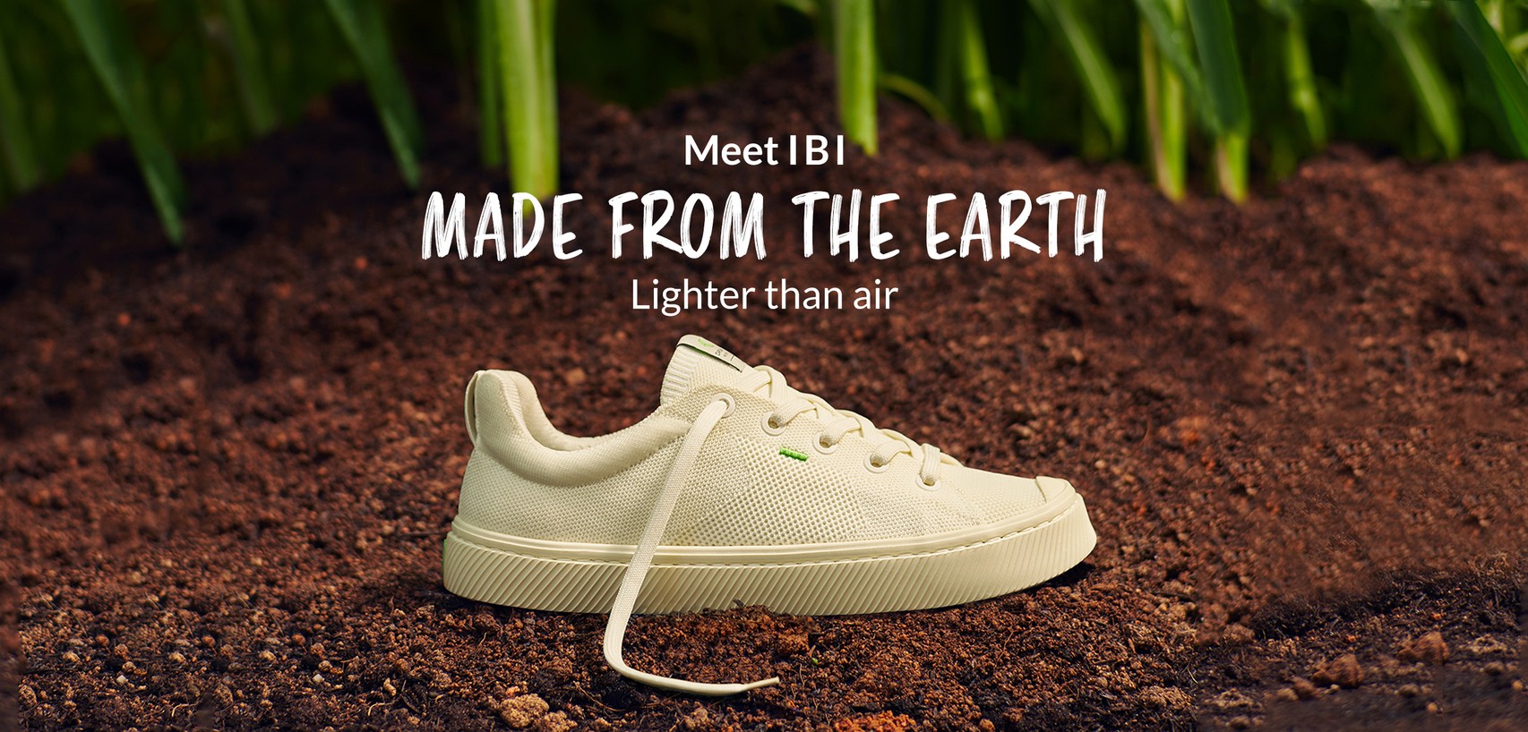
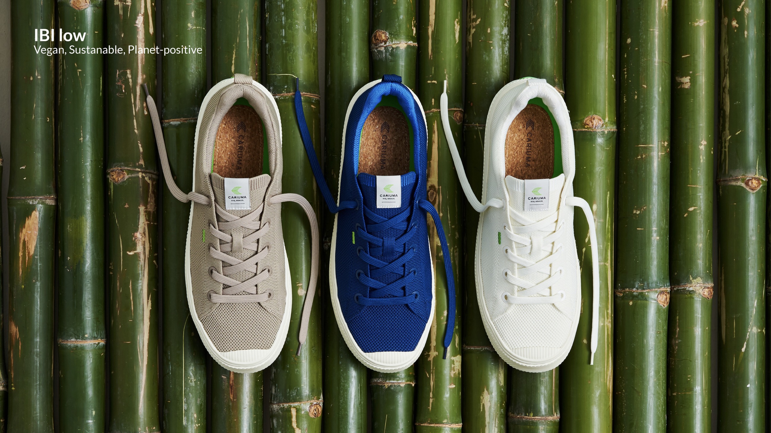
Better for people
and the planet.
Four innovations, one simple story
Bamboo knit
Breathable upper, knitted to fit: the reason the shoe feels like nothing.
Sugarcane EVA
Plant-based midsole replacing petroleum foam, with cork underfoot.
Recycled & neutral
Recycled content throughout, and a carbon-neutral product overall.
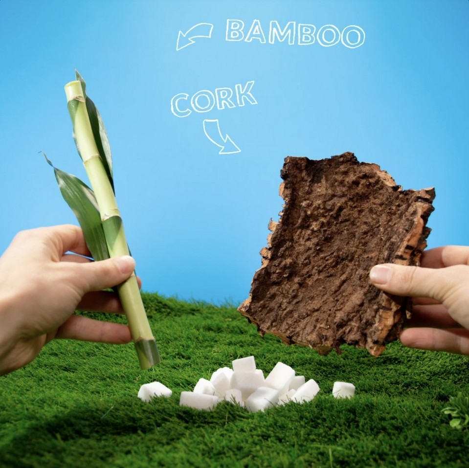
Three days, from empty studio to forest
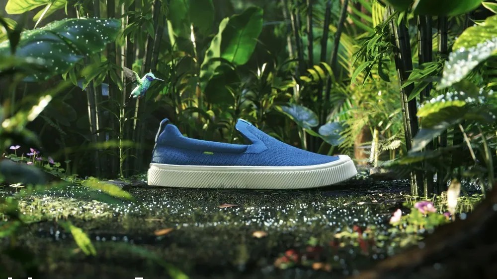
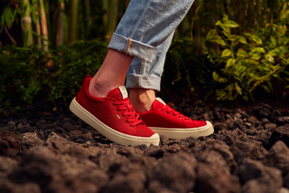
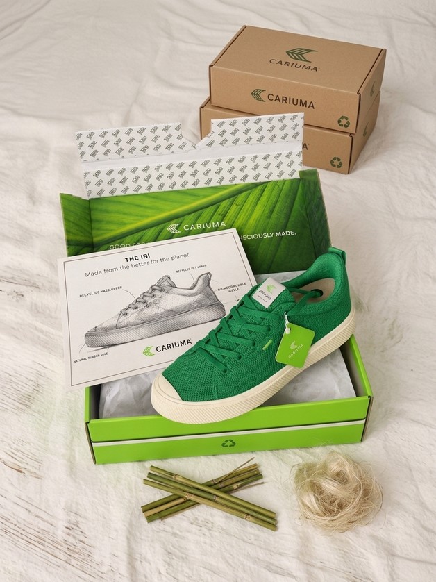
For three days we transformed a studio into a small forest using real plants and real soil. Bamboo and sugarcane, the same materials the shoe is made from, became the set.
Build
Lighting and structure going up around the planting.
Plant
Real turf, soil and living plants laid by hand.
Shoot
Directing product inside the set, not against a backdrop.
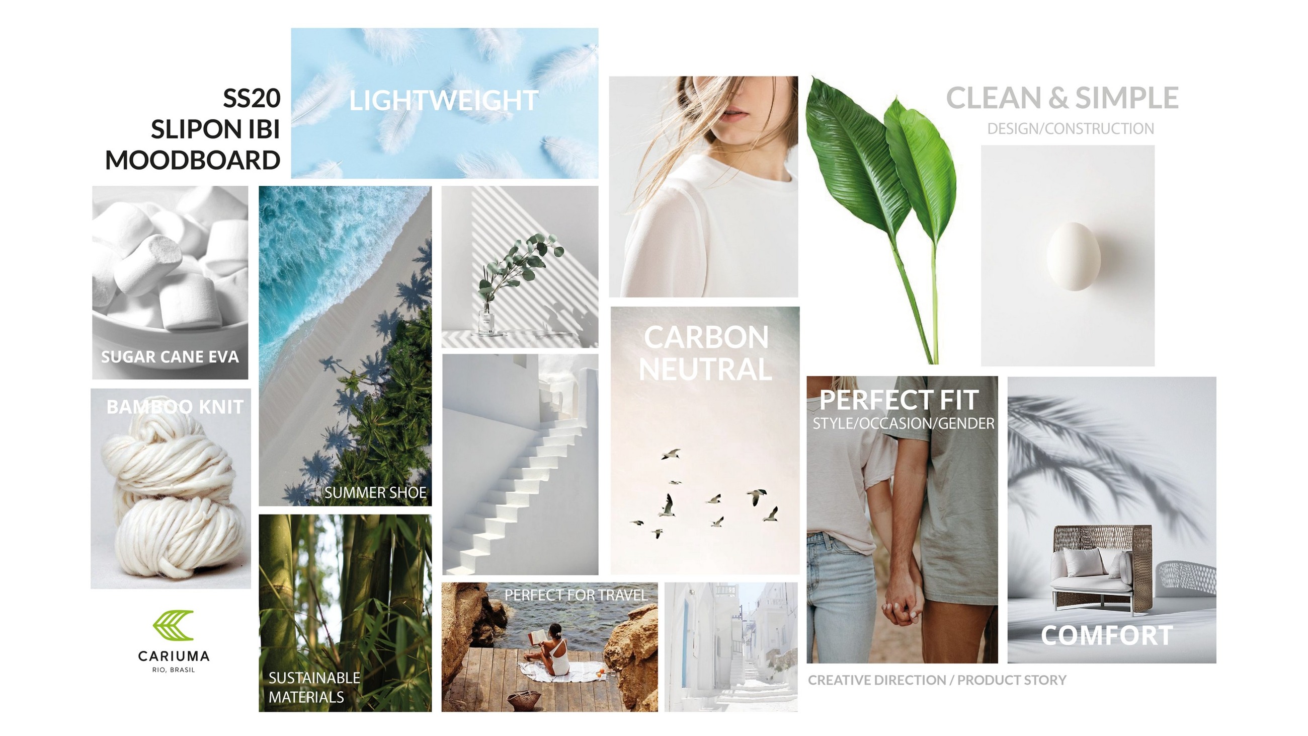
From mood board to campaign
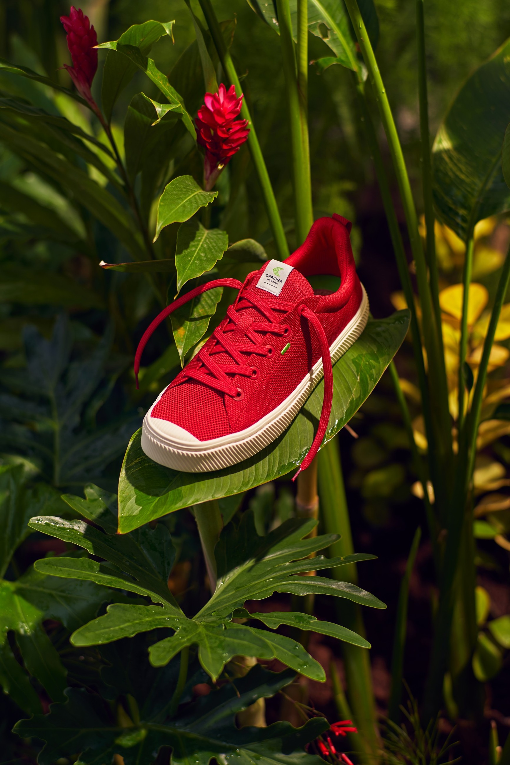
One shoot, one visual language: product still life and lifestyle in a single shoot formed the core visual library for the whole launch, designed from the outset for e-commerce, social, retail and large-format print.
Sustainability, worn
The lifestyle work had one job: make the shoe look like an easy choice rather than a virtuous one.
Everyday
Colour and movement, planted in real ground.
Performance
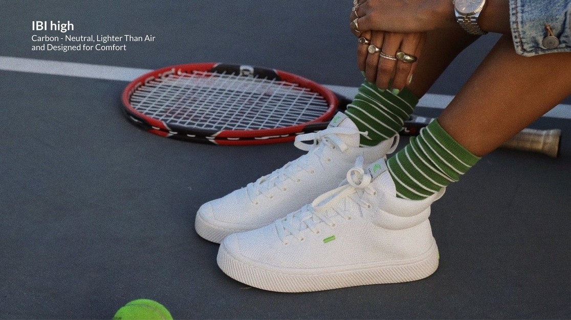
IBI High: carbon neutral, lighter than air.
Aspiration
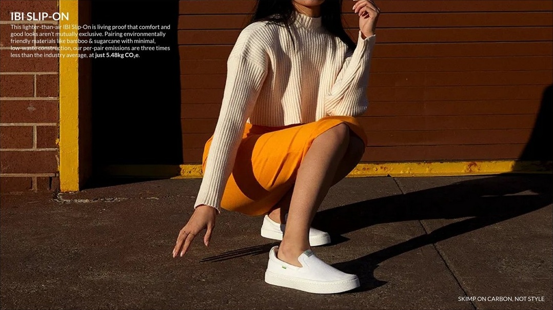
Slip-On: style first, carbon second.
Three films, three different jobs
Each had a distinct creative role rather than being a re-cut of the same idea: IBI Launch · IBI High, materials · IBI Slip-On, aspiration.
Making sustainability feel effortless.
Goal: introduce IBI as a new generation sneaker, combining sustainability with everyday performance. Approach: a visual narrative connecting the product to the planet in a light, optimistic way, focused on freedom of movement and ease, dynamic and accessible in tone. Result: strong emotional resonance and clear product understanding, and an IBI that sold out within two weeks.
Making innovation easy to understand.
Goal: introduce a new silhouette while educating consumers on material innovation in a simple, memorable way. Approach: complex material stories translated into a playful, almost tactile visual language with clear, almost childlike logic. Result: stronger product transparency and trust in the brand’s material choices.
From sustainability to aspiration.
Goal: elevate the perception of the IBI line with a more premium, emotional layer. Approach: a cinematic world in the Brazilian rainforest, linked to the brand’s tree-planting initiative, with a hummingbird guiding the creation of the product. Result: a sophisticated new dimension of the brand’s visual language, with its sustainability core intact.
From launch to every touchpoint
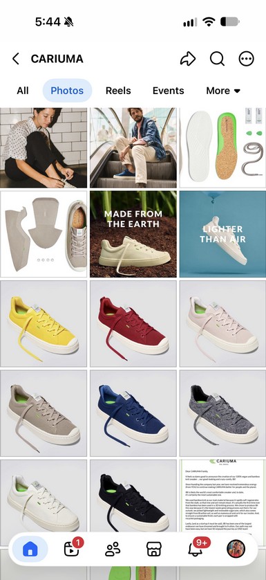
The campaign was designed as a complete visual system, not a single advertising moment. Core photography and films were adapted across the whole customer journey.
Adapted
One library re-cut per channel, so nothing was shot twice.
Consistent
Every application carried the same core idea: make sustainable innovation visible and easy to understand.
Five channels
Social, e-commerce and digital, retail, print and packaging.
The campaign, live
What it did
Sold out in two weeks
The launch cleared available stock inside a fortnight.
Demand past availability
Customers kept waiting well after stock ran out.
A new benchmark
Set the reference for how Cariuma tells material innovation.
The operating picture
- Reported to
- CEO of Cariuma
- Led directly
- 5 designers, 2 photographers, 2 editors
- External partners
- Photographer, DOP, set builder, post house, copywriter, stylist, videographer
- Timeline
- Brief to launch in 11 months
Why it mattered
IBI became more than a product launch. It gave Cariuma a way to turn complex material innovation into something people simply wanted.
Leading it meant concept, art direction, photography and film on one launch, and holding a single idea steady from a studio full of soil all the way to a shoe box.
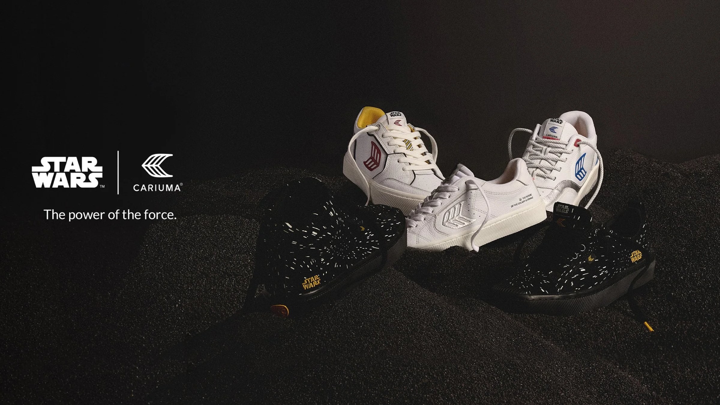
Star Wars
From screen to street: translating a cinematic universe into product people actually wear.
Snapshot
- Client
- Cariuma
- Licensor
- Lucasfilm / Disney
- Category
- Footwear, limited-edition capsule
- Season
- FW 2024
- My role
- Creative Director & Head of Design
- Owned
- Creative direction · Product design · Art direction
- Partners
- Disney licensing · Marketing · Photography · Social media · Press
Two audiences. One shoe.
Star Wars fans wanted proof of fandom. Cariuma’s audience wanted a minimal, sustainable sneaker they would wear every day. The collection had to satisfy both, without compromising either.
For the fans
Collectible detail. Character cues specific enough to be recognised and named.
For everyone else
A clean white sneaker. No costume, no licence-plate branding.
The constraint that shaped everything
Sustainable materials and Cariuma’s minimal design language were non-negotiable, so the storytelling had to live in construction, not in print.

A galaxy far, far away,
close enough to wear.
Nostalgic · Collectible · Sustainable
Loud to fans. Quiet to everyone else.
Every Star Wars cue was engineered to be discovered rather than displayed: legible to the people who would recognise it, invisible to the people who would not.
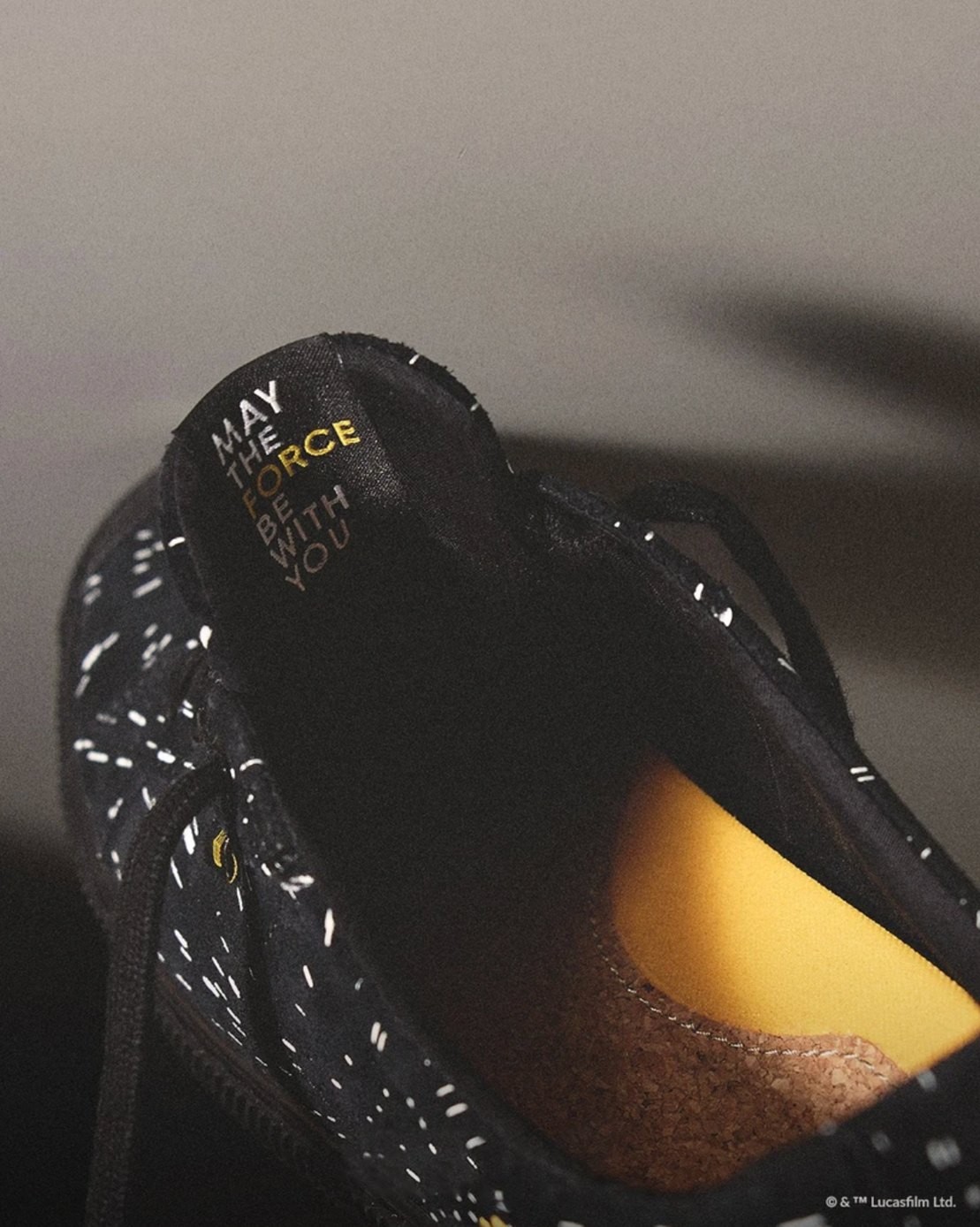
Woven tongue label
Character name outside, hidden message inside the shoe.
Sole debossing
Star Wars logotype cut into the tread, visible only off the foot.
Heel emblems
One character per edition, debossed into the midsole rather than printed.
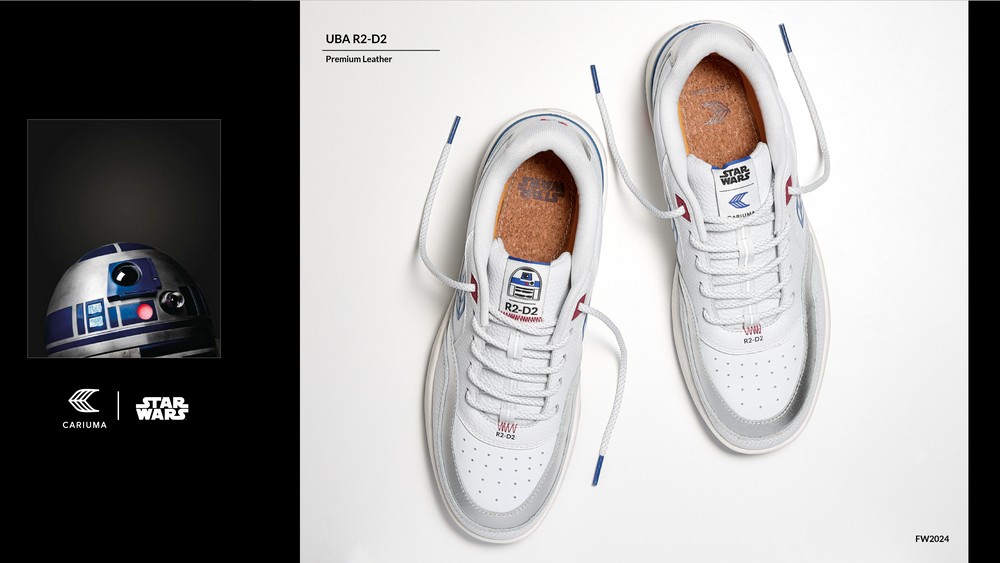
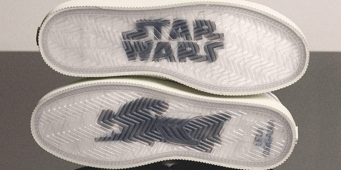
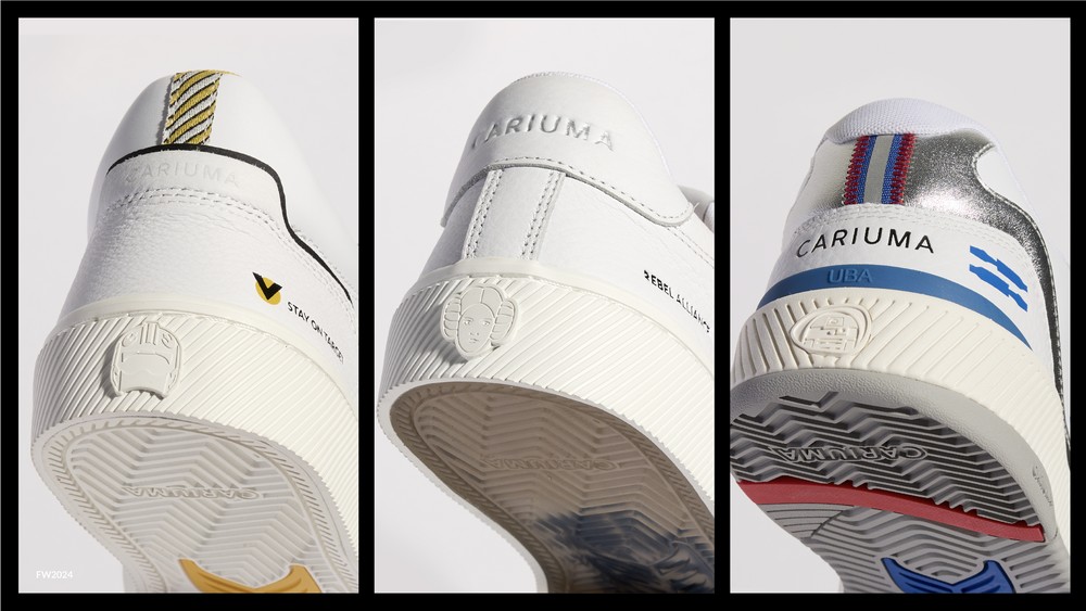
Character affinity, mapped by segment
We mapped which characters carried weight with which audience before deciding which editions to build. R2-D2 was the only character to appear across all four segments.
Men 18+
Darth Vader, Stormtrooper, R2-D2, Yoda, Chewbacca
Women 18+
Luke Skywalker, Boba Fett, The Mandalorian, Chewbacca; Princess Leia, R2-D2, Darth Vader
Youth, boys
Darth Vader, Yoda, R2-D2, Chewbacca; Luke Skywalker, Grogu, The Mandalorian, Stormtrooper
Youth, girls
Grogu, Ahsoka, BB-8, Princess Leia, R2-D2, Darth Vader
Four stages, concept to campaign
- Research & conceptAudited the universe for cues that could carry design rather than costume.
- Design & moodboardingMood boards, sketches and colour studies translating those cues into Cariuma’s language.
- Prototyping & materialsWorked with the product team on sustainable materials, texture and palette per edition.
- Campaign developmentDirected marketing, photography and design teams to build the launch narrative.
The mood board
Turning a galaxy far, far away into shoes people can experience, connecting fantasy, nostalgia and joy in every step.
References
Key scenes · Leia’s costume · Pilot flight suit · R2-D2 panelling · Rebel insignia · Hyperspace
Tone
Nostalgic · Collectible · Restrained
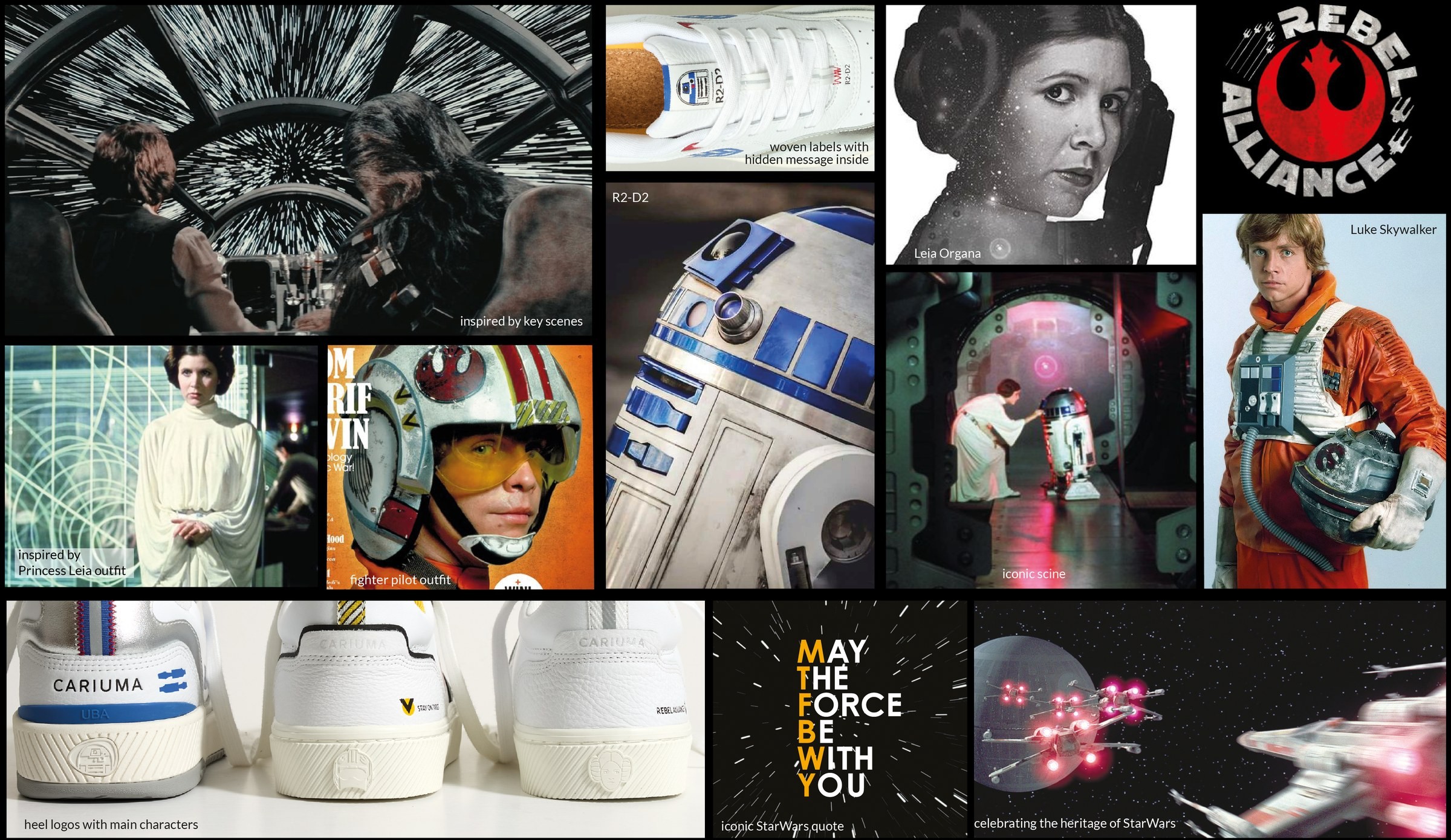
Two routes for the shoot
Two genuinely different routes, presented as a decision. The second became the campaign.
01 The Reflection of Legacy
Mood: calm, reverent, timeless. Light: directional side key, soft shadow gradient. Detail: soles and construction from unexpected angles.
02 Floating Through Space
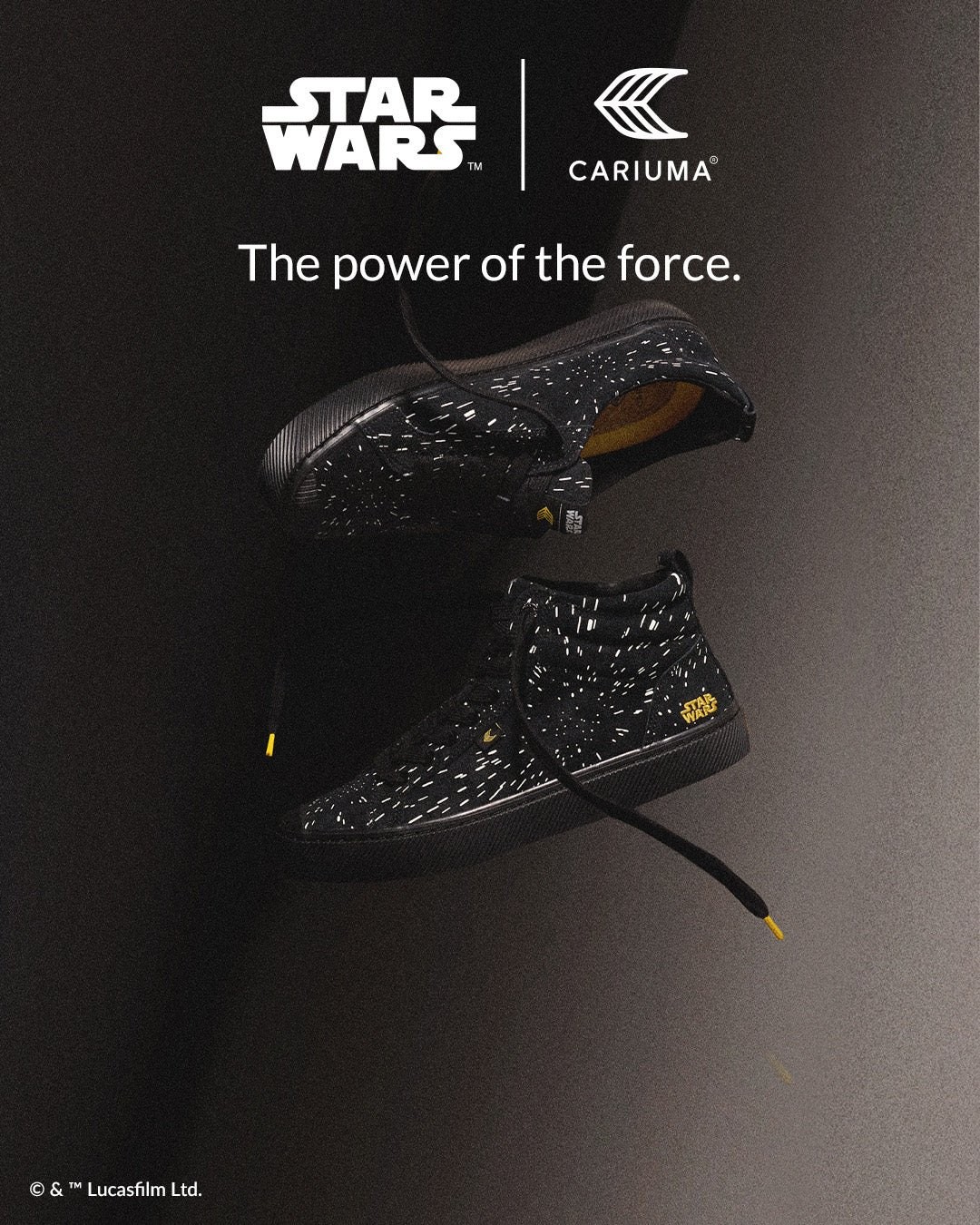
Mood: airy, weightless, hopeful. Light: soft cinematic key with rim glow, vintage light leak. Detail: texture and stitching; the shoe suspended mid-air.
Four editions, one language
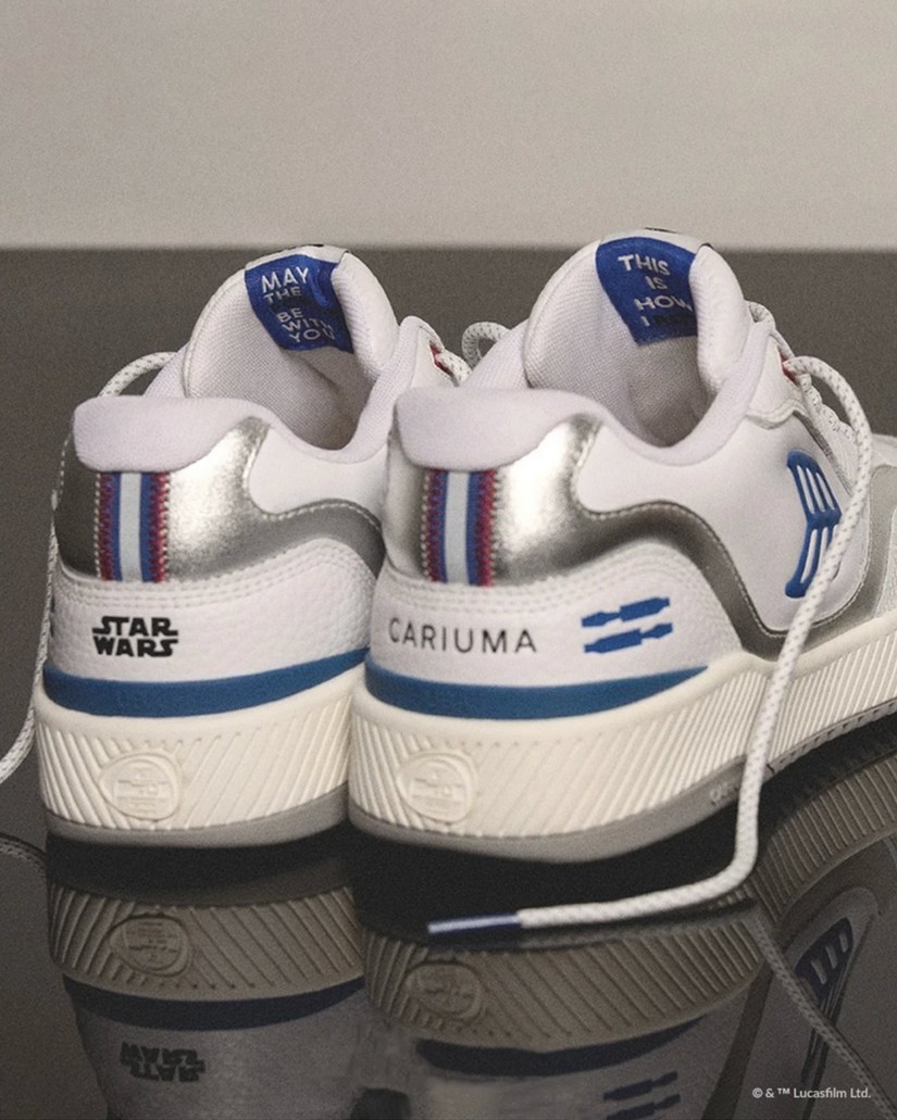
R2-D2
Premium leather, silver panelling, blue deboss details, woven character label.
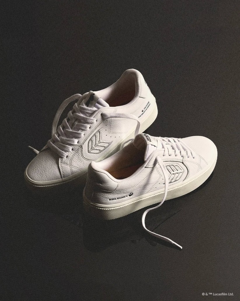
Leia Organa
All-white premium leather, Star Wars printed sole with transparent natural rubber.
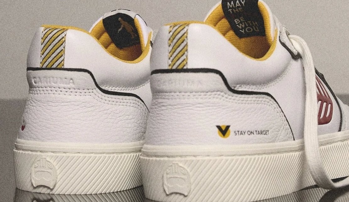
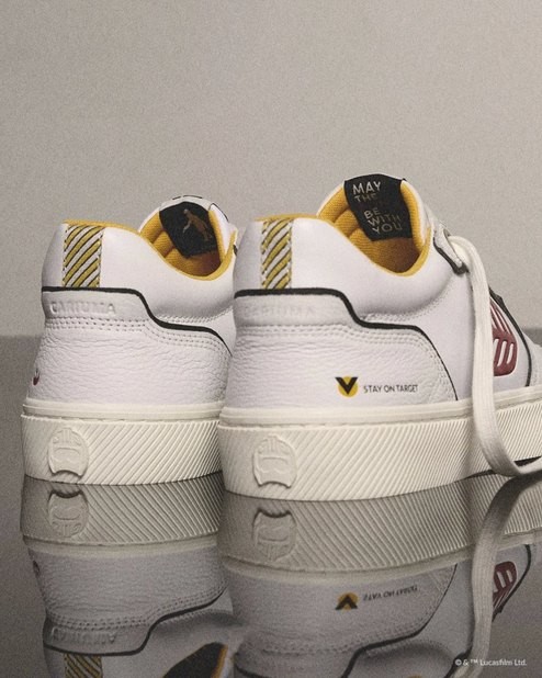
Stay on Target
Gold lining, pilot chevron, rebel red logo, character heel details.
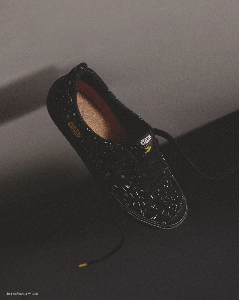
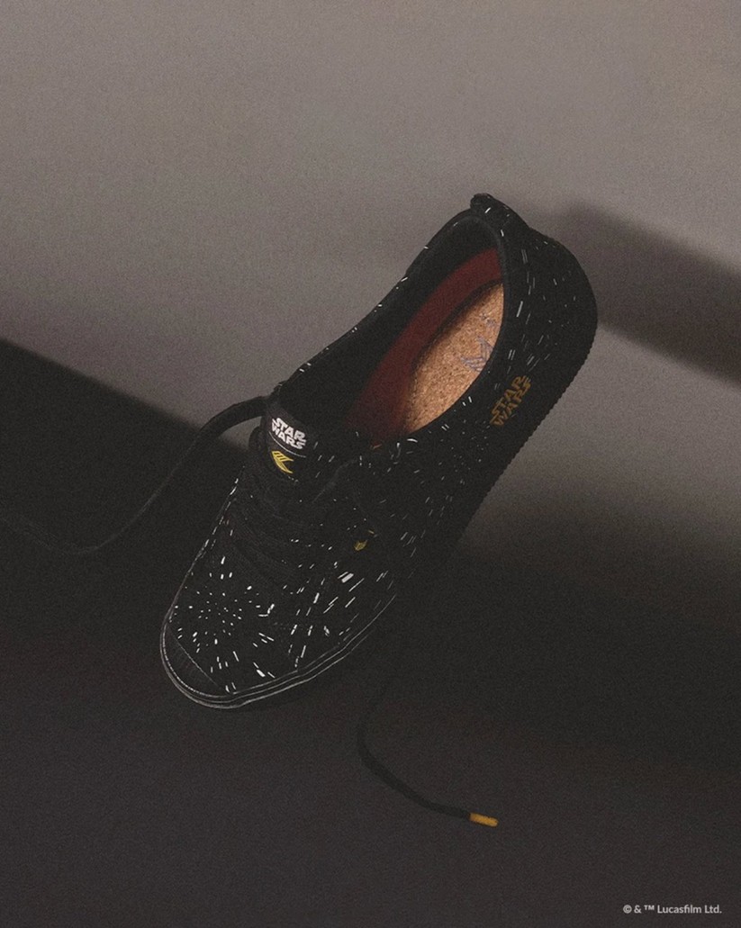
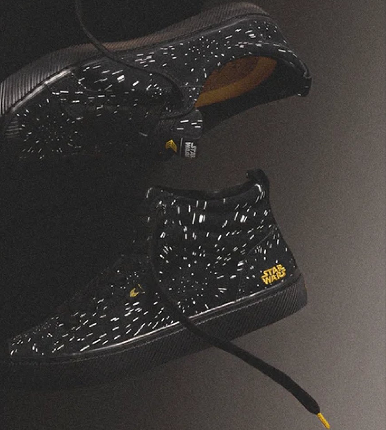
Hyperspace
Speckled printed suede, cork footbed, gold tipping.
Storytelling built in, not printed on
The narrative had to survive Cariuma’s sustainability standard, so every cue lives in a material or a mould.
Premium leather upper
Character colour blocked into the panels. Premium pebbled leather, natural rubber, recycled laces.
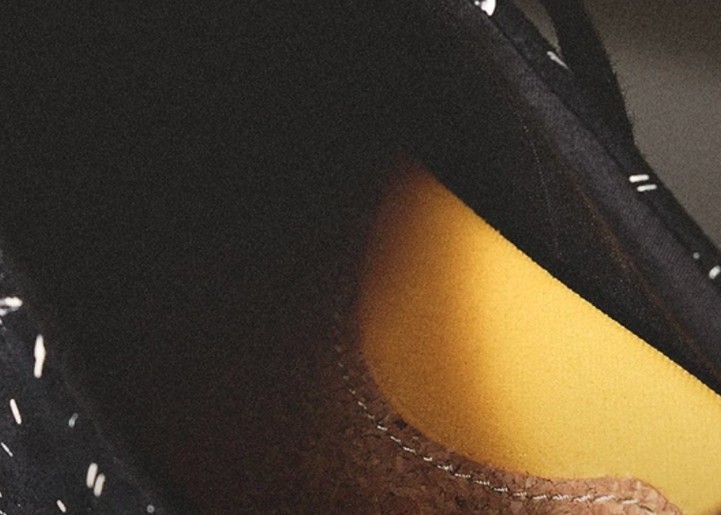
Cork footbed
Natural cork with a gold-toned memory foam. Natural cork layer, Mamona oil memory foam.
Printed outsole + transparent rubber
Logo printed to a foot bead and covered with transparent rubber outsole. Natural Brazilian rubber, recycled plastic footbed.
One statement, every touchpoint
Neutral backdrops with a cosmic edge. Vintage cinema cues in post: film scratch, soft gradient, muted primaries from the films held against Cariuma’s minimal palette.
- Reef blue
- Pilot gold
- Rebel red
- Rebel white
Product stills
Every edition, four angles.
Hero campaign
Key visual and crops.
Social loops
Floating-sneaker sequences.
Microsite
Landing page and banners.
Launch and restock flows.
Retail
In-store and packaging.
The campaign, live
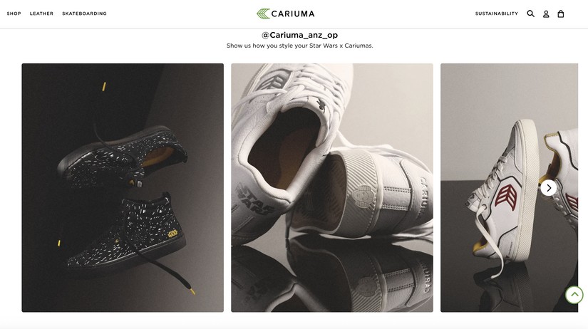
One directional statement, held across every channel it shipped to: heritage meets the future, fandom meets sustainable lifestyle.
The press
Earned, not paid. Coverage ran from national entertainment press through to design and collector titles.
What it did
Licensed by Disney
Full Lucasfilm approval across product, packaging and campaign.
Five national placements
Variety, Rolling Stone, CNET, SheKnows, The Coolector.
Delivered end to end
Concept through to retail, social and CRM assets.
The operating picture
- Reported to
- CEO of Cariuma
- Led directly
- 1 photographer, 2 graphic designers, 2 product designers, 1 technical designer, 2 product developers, 1 social media manager, 1 copywriter, 1 PR manager
- External partners
- Disney Star Wars licence team
- Timeline
- Brief to launch in 7 months
Why it mattered
A legendary universe translated into something people wear on an ordinary Tuesday: fandom made wearable, sustainability left intact.
Leading it meant holding one visual idea steady across product design, photography, styling, post-production, Disney licensing and internal brand, and shipping it.
Peanuts
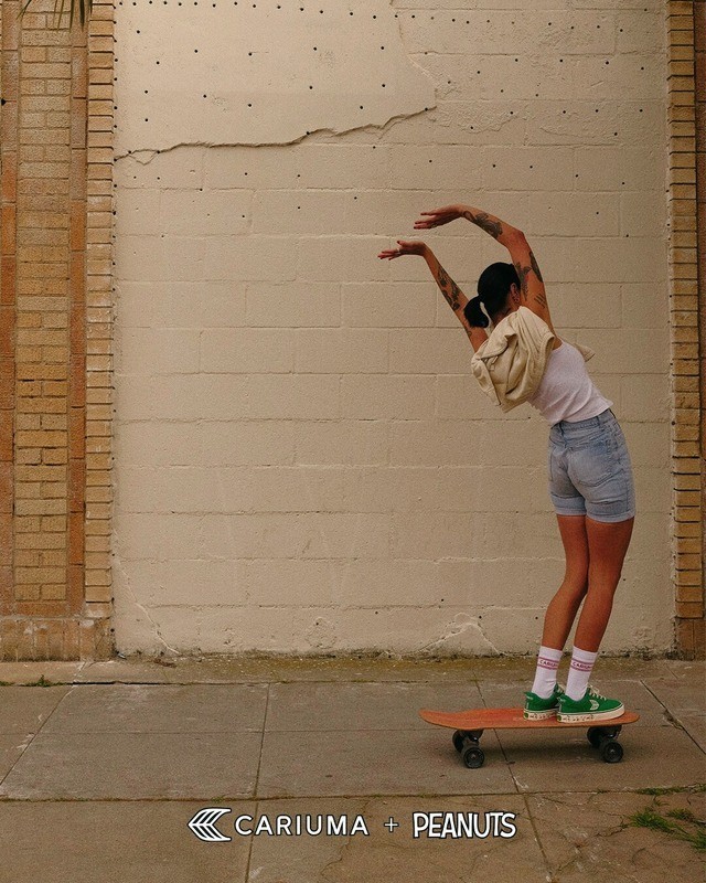
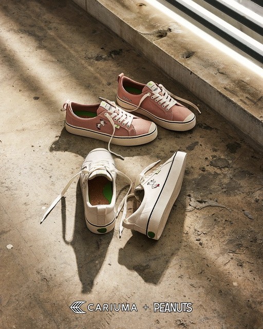
Playful icons, reimagined for a conscious generation: a licensed collection across apparel, footwear and packaging.
Snapshot
- Client
- Cariuma × Peanuts
- Category
- Licensed collection: apparel, footwear, packaging
- Capsules
- Retro Skate (July 2023) · Earth Day
- My role
- Creative Director & Design Lead
- Led
- Concept, visual direction, CMF strategy, product and packaging design
- Worked with
- PEANUTS Worldwide · Cariuma product and marketing teams
- Press
- People · Billboard · Rolling Stone · Hypebeast · Highsnobiety
Playful, but not childish
Peanuts is one of the most recognisable properties in the world, and most of what is made with it looks like it was made for children. Cariuma sells understated, sustainable design to adults.
The tension
Balance the humour and warmth of Peanuts against Cariuma’s quiet, sustainable sophistication, without either brand having to shout.
The audience
Adults who value design, quality and emotional connection. Nostalgia had to be a feeling, not a costume.
The constraint
A licensor with strict character guidelines, so the invention had to happen in styling, colour and placement rather than in the characters themselves.
Reading the archive before touching it
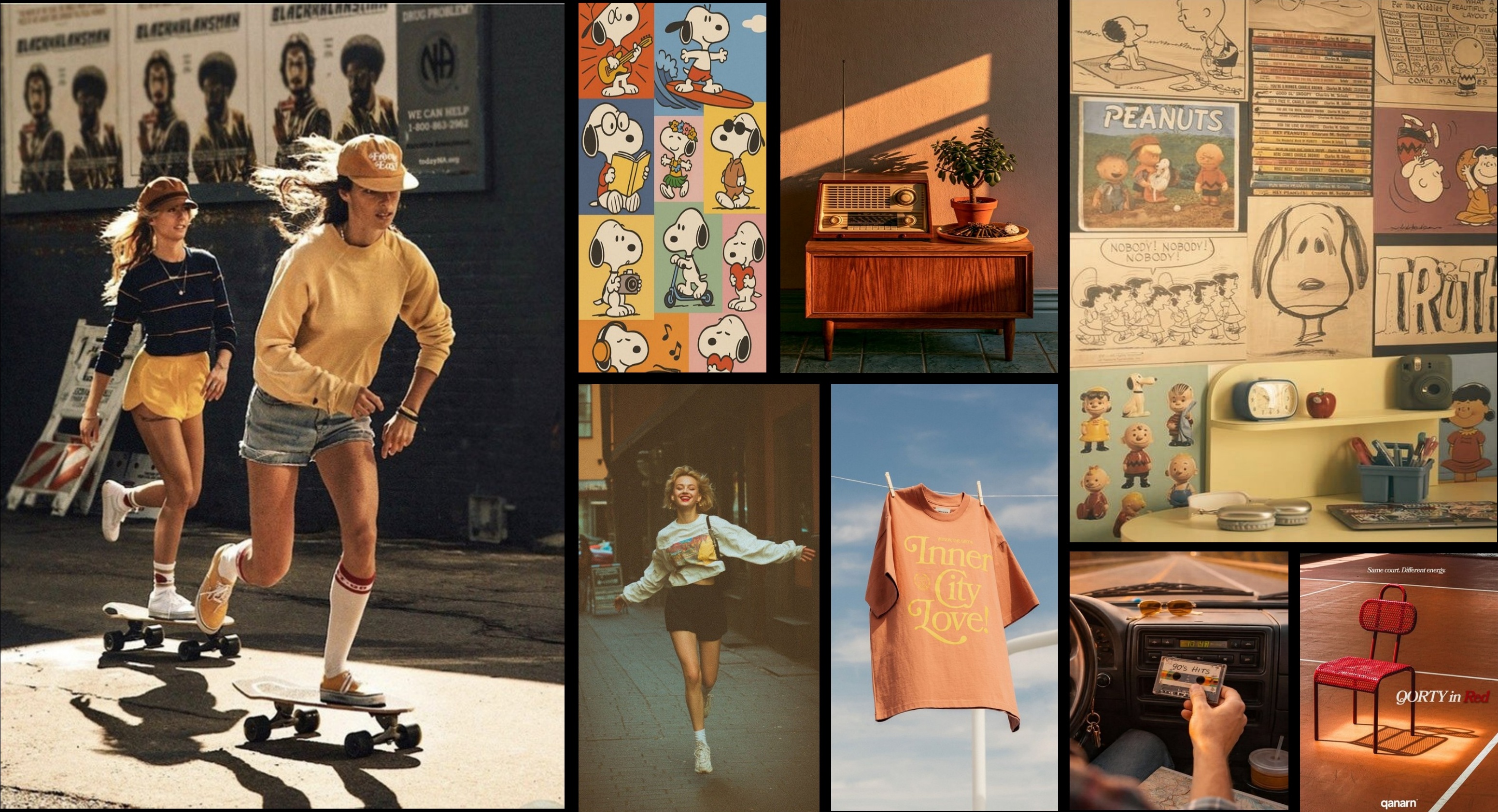
One collaboration, two directions: 1. Nostalgic skateboarding. 2. Sunny Earth Day.
Taken forward
Flat strip colour · Sun-faded palette · Quiet single gag · Expression, not likeness
Deliberately left
Full-cast scenes · Cartoon brightness · Speech bubbles · Merchandise look
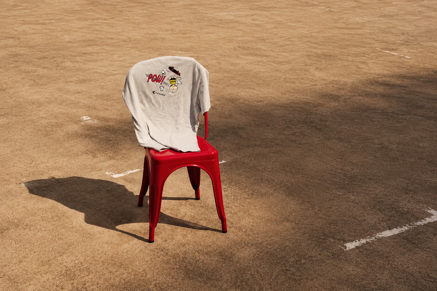
Play with purpose.
The grown-up version of fun
We built the narrative around the idea that joy is a conscious act, a bridge between childhood curiosity and adult responsibility. Each product became a daily reminder to stay grounded, sustainable and joyful.
Colour & light
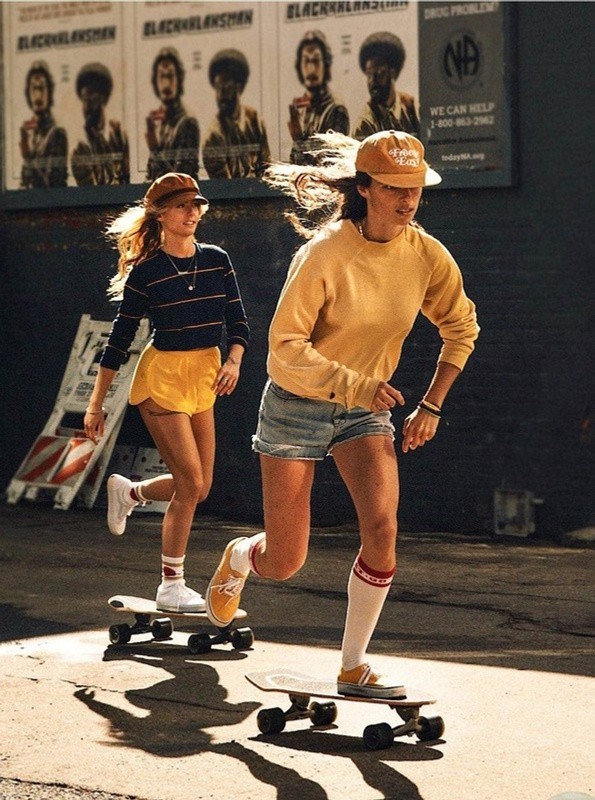
Warm, sun-washed tones that evoke comic nostalgia without relying on literal reference.
Styling
Minimalist wardrobe in neutral hues, so the product stays the storytelling canvas.
Tone & composition
Candid and quietly joyful. Negative space and symmetry for Cariuma’s balance; playful gesture for Peanuts’ humour.
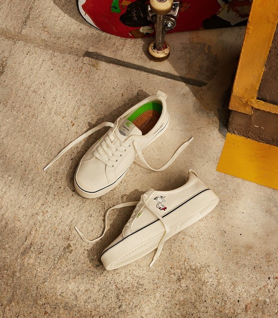
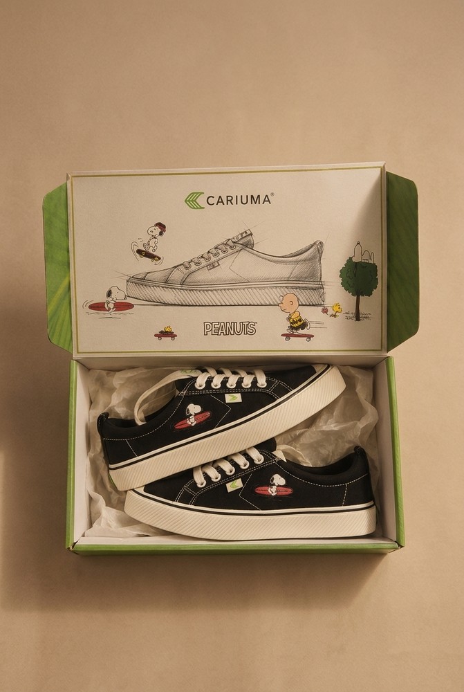
One story, one system
CMF strategy
Colour, material and finish fused nostalgia with modern simplicity, the part of the brief that kept it out of novelty territory.
Consistency
Every colourway had to carry the same story without a separate shoot or a separate idea.
Styling
Minimalist wardrobe in neutral hues to keep focus on the sneakers.
Packaging
Designed alongside the product, so the reference landed before the box was even open.

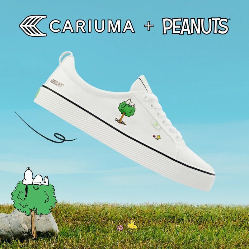
The lightness
of doing good.
As light as air
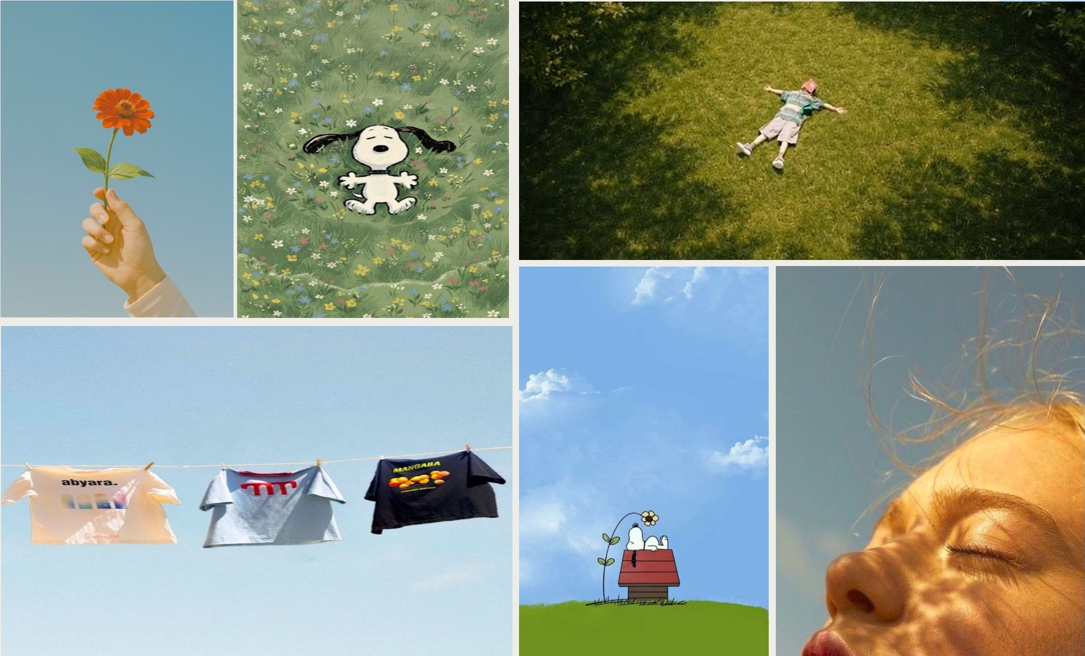
Inspired by Earth Day, the visuals had to feel as light as air, a metaphor for how conscious choices can also be joyful. The art direction highlighted weightlessness, simplicity and harmony with nature.
- Sky blue
- Soft green
- Bright white
- Off black
Composition
Floating objects, clean negative space, open skies: hope and environmental awareness made structural.
Product focus
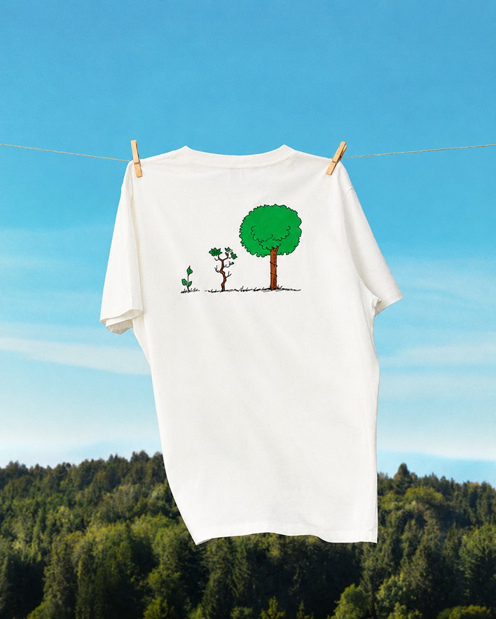
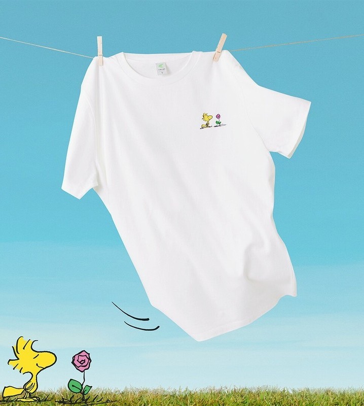
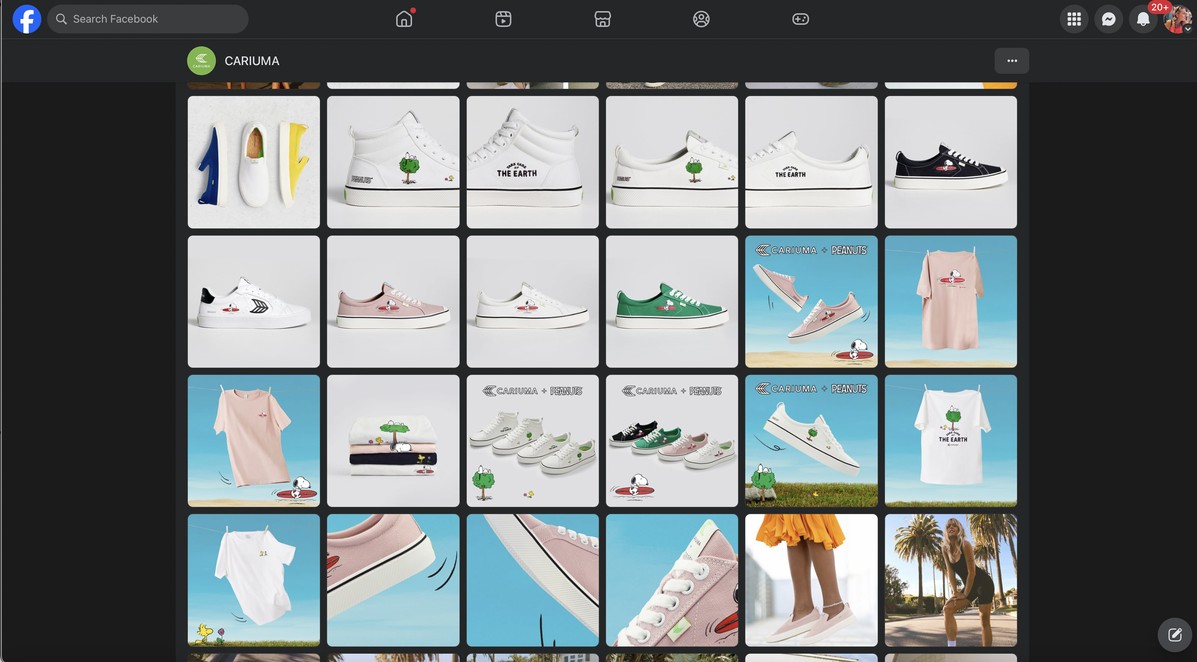
Organic cotton tees and canvas sneakers carrying Snoopy and Woodstock planting trees and flowers.
Typography & layout
Generous spacing, mirroring the campaign’s breathing room and emotional calm.
Where the licence earns its keep
The idea
Care for the planet begins with small, mindful actions, much like the simple optimism of Snoopy and Woodstock.
The execution
Hand-drawn comic detail merged with real photography, so 2D charm and product truth sat in one frame.
The restraint
One artwork, used once, at one scale. The message would not have survived being repeated across the range.
The same idea, worn three ways
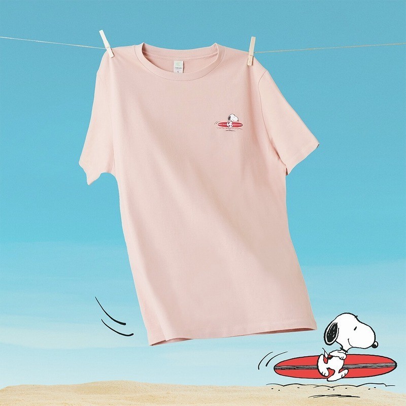
Placement did the work again: the character planting, the character resting, the character playing. Three moods from one licence and one palette.
Composition
Floating objects, clean negative space, open skies, symbolising hope and environmental awareness.
Product focus
Organic cotton tees: Snoopy and Woodstock planting trees and flowers, visual cues for care and renewal.
Playful
Motion and humour, placed off-centre to keep it casual.
How it went out
The collection launched across social, digital and e-commerce on 25 July 2023, with campaign copy carrying the same cross-generational tone as the product. Launch copy: “Something for the daydreamers, the friends, the skaters, the surfers, and tree-planters alike.”
The press
Mainstream editorial pickup, plus Hypebeast and Highsnobiety, and the collection was featured by Peanuts Worldwide itself.
What it did
Fastest-selling capsule
One of Cariuma’s fastest-selling collaborations.
Mainstream editorial pickup
People, Billboard and Rolling Stone, plus Hypebeast and Highsnobiety.
Amplified by the licensor
Featured by Peanuts Worldwide: the rights holder chose to promote it, which is not a given.
The operating picture
- Reported to
- CEO of Cariuma
- Led directly
- 1 photographer, 2 graphic designers, 2 product designers, 1 technical designer, 2 product developers, 1 social media manager, 1 copywriter, 1 PR manager
- External partners
- Creative Director of the Peanuts collaboration team, licence team, photographer, copywriter
- Timeline
- Brief to launch in 8 months
Why it mattered
From a breakout launch to a lasting partnership. The first Cariuma × Peanuts collection sold out within weeks, and the partnership expanded into two additional collections.
One collaboration. Three collections. A successful blend of cultural relevance, product storytelling and brand appeal, translating creative collaboration into customer acquisition and revenue growth.
Lune Wuf
Repositioning a Singapore dog gear brand around the one thing its owners actually wanted: control they could trust.
Snapshot
- Client
- Lune Wuf, Singapore
- Category
- Dog walking systems: harnesses, leashes, collars
- Studio
- DesignStep
- My role
- Brand strategy, positioning, identity system, content direction
- Brief
- An existing brand with good hardware and no clear position
- Delivered
- Strategy · Brand book & visual identity · Positioning · Content guide
- Timeline
- Four workstreams across roughly seven weeks
Good hardware, no argument
Lune Wuf already had the difficult part: lab-tested components, a real product range, a functioning store. What it did not have was a reason for any of it to matter to a buyer.
The symptom
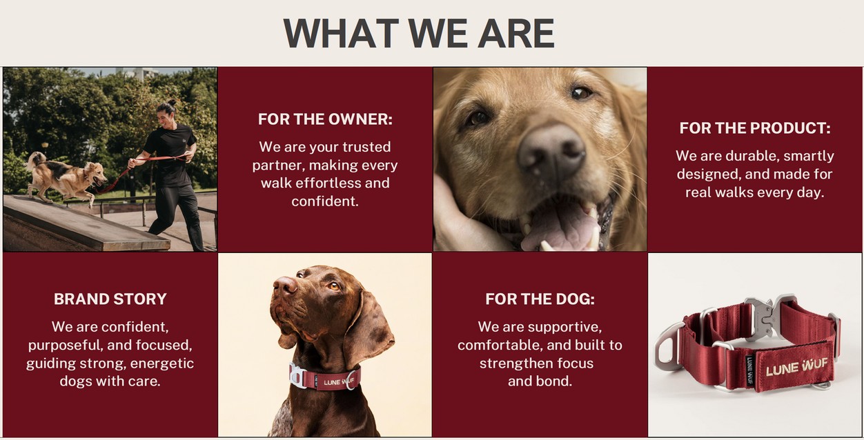
Marketing sat in the same place as every competitor: cute dogs, soft language, feature lists. Strong engineering described in the vocabulary of a pet accessory.
The real problem
Owners of strong, pulling dogs were being sold on charm when what they were shopping for was structure.
The brief I set
Find the argument the product had already earned, then build an identity and a content system that could carry it.
You’re not selling leashes.
You’re selling authority.
Control · Trust · Structure
How the position was found
- Map the categoryCompetitors benchmarked, including Ruffwear, EzyDog, PetSafe and Atlas Pet internationally, plus four Singapore brands. The category splits cleanly into technical-but-ugly and pretty-but-weak.
- Segment the ownersSeven owner types built from stated complaints, not demographics. Most owners turned out to be a blend of two or three, which is exactly why the category’s messaging was unfocused.
- Choose, and write the ruleFunction-First Safety Seekers as primary; Practical Problem-Solvers and Style-Driven as secondary. The rule: primary defines product architecture, secondary defines visual expression.
- Build the expressionPositioning into identity into a content system, so the argument survives contact with a real Instagram grid.
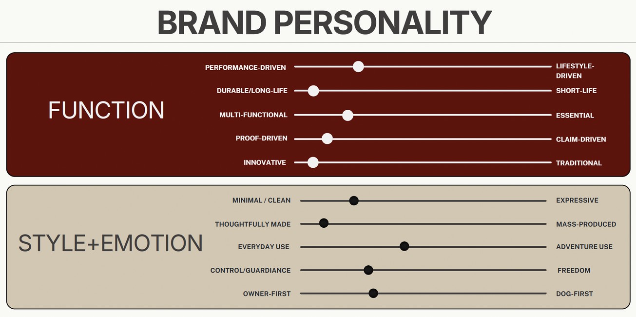
Calm authority, not cuteness
Premium walking systems that help owners lead strong, dynamic dogs with confidence.
Mission
To help dog owners guide strong, dynamic dogs with confidence, strengthening the bond on every walk.
Three foundations
Calm Guidance · Everyday Confidence · Made With Purpose.
Five values
Control Creates Confidence · Strength Thoughtfully Engineered · Proof Over Promises · Designed for Everyday Reality · Quiet Premium.
The line
Move with confidence, made with purpose.
The claim the product could back
Every material claim was written with a why-it-matters line attached. A number with no consequence is not proof.
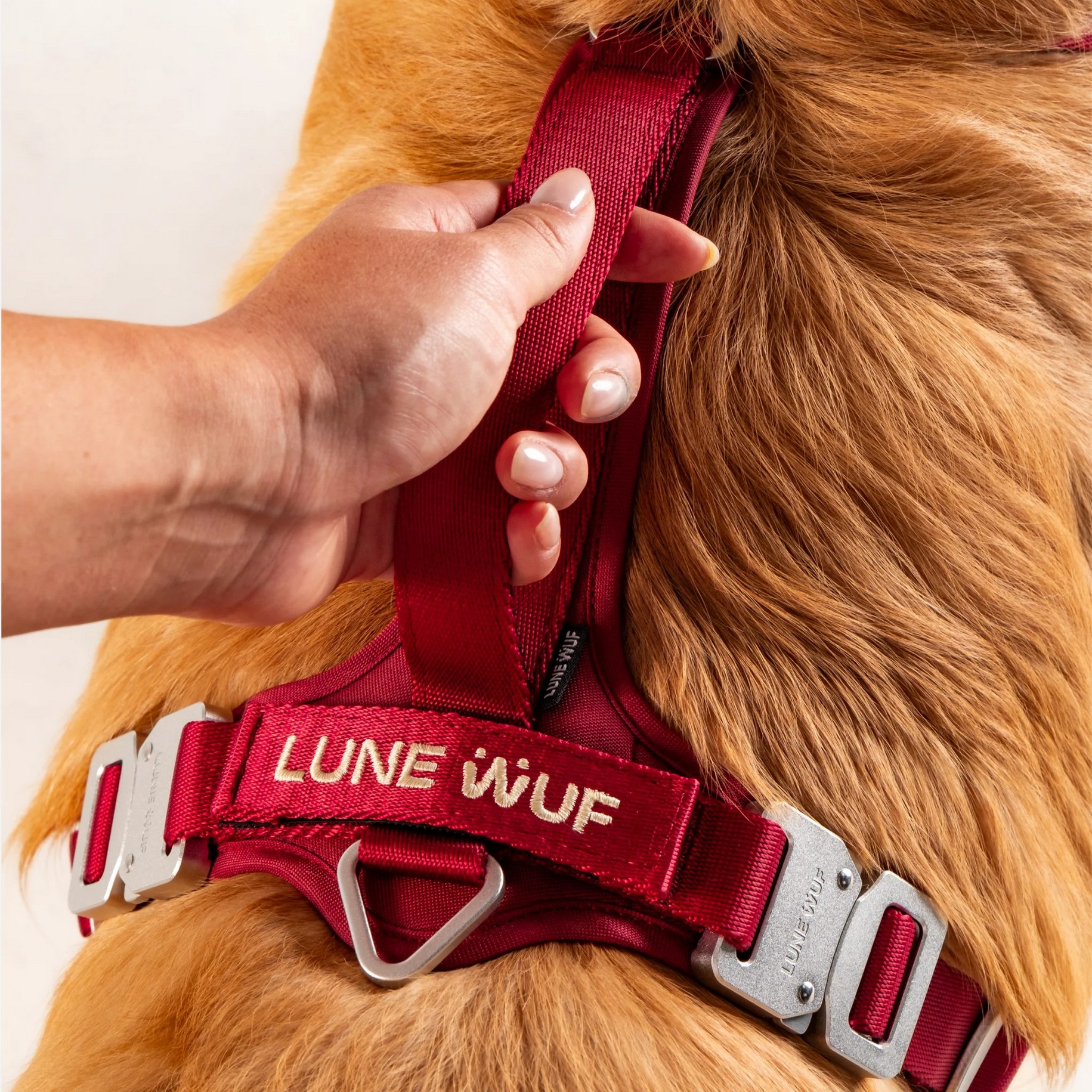
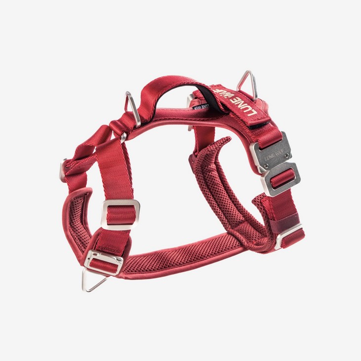
Zinc alloy buckle
Signature quick-release, specified against rust and corrosion.
430kgf breaking force
Independent straight-pull tensile test conducted by SGS.
100% nylon webbing
Explained through a parachute canopy rather than a specification.
Aviation aluminium
Explained through an aircraft wing: familiar object, transferred trust.
Strategy, made producible
The final workstream was a content guide: tone of voice, approved and banned vocabulary, a six-step narrative framework, casting, location and grading direction. Built so someone else could execute it without me.
One position, two typographic voices
The identity had to hold a premium, engineered tone in two very different places, a considered product page and a fast-scrolling feed. Rather than force one typeface to do both, I split it.
Web
Inter, Bold and Regular. Neutral, structural, gets out of the way of the product.
Social
Montserrat ExtraBold with Libre Baskerville Italic: weight to survive a feed, italic serif to keep the warmth.
Colour discipline
Signature Red carries the whole brand. Sand and accent exist to keep it from reading as sport. Single-colour logo execution, defined clear space and minimum sizing.
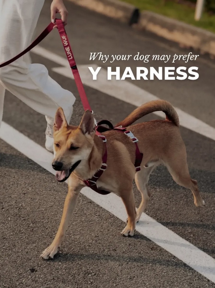
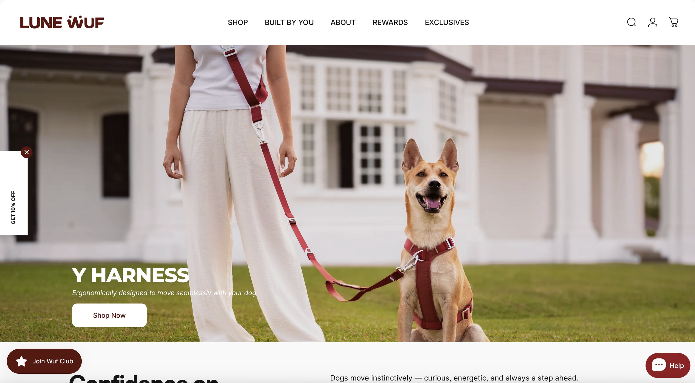
The position, running live
The line, shipped
“Move with Confidence · Designed with Purpose” runs as the site’s own headline.
The vocabulary held
“Walking systems”, not accessories. “Ergonomically designed”, not comfortable.
The register held
Calm, structural, product-forward. No cuteness anywhere on the page.
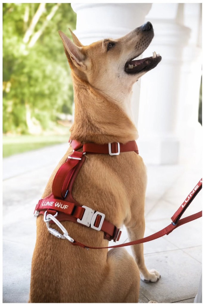
From strategy to story
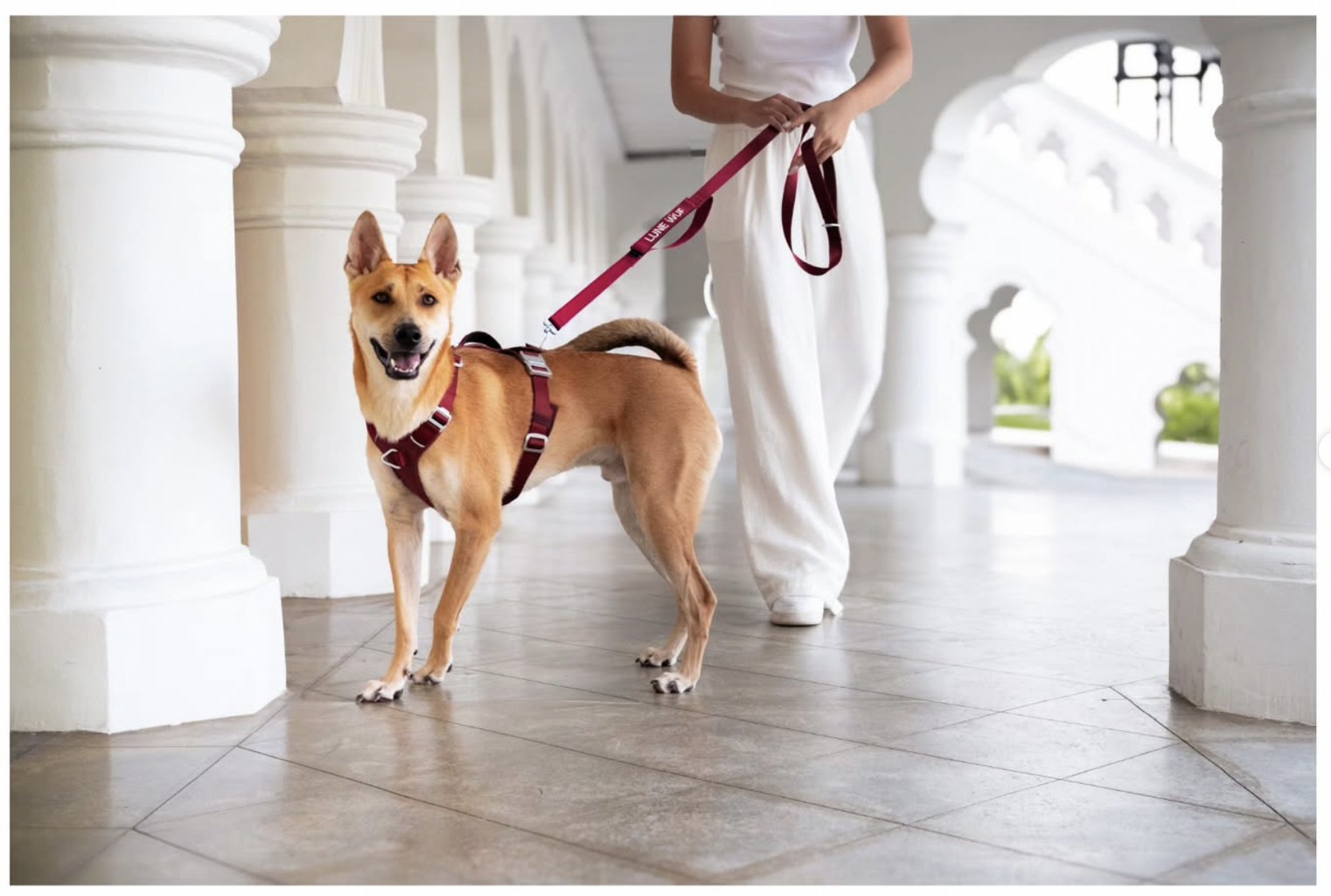
Turning the brand positioning into a consistent visual language across photography and campaign assets.
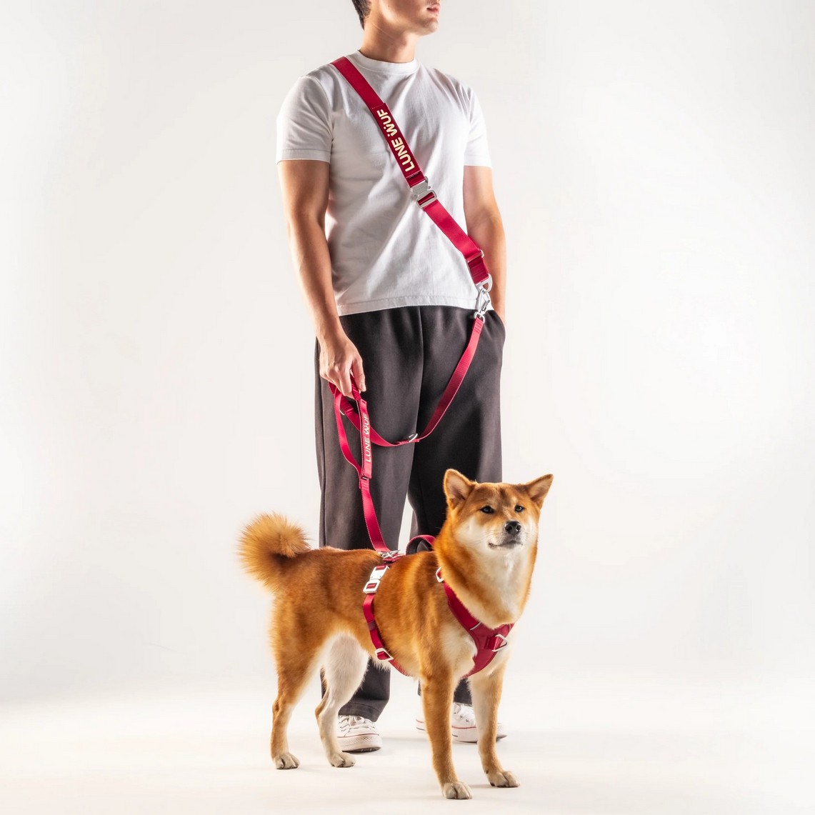
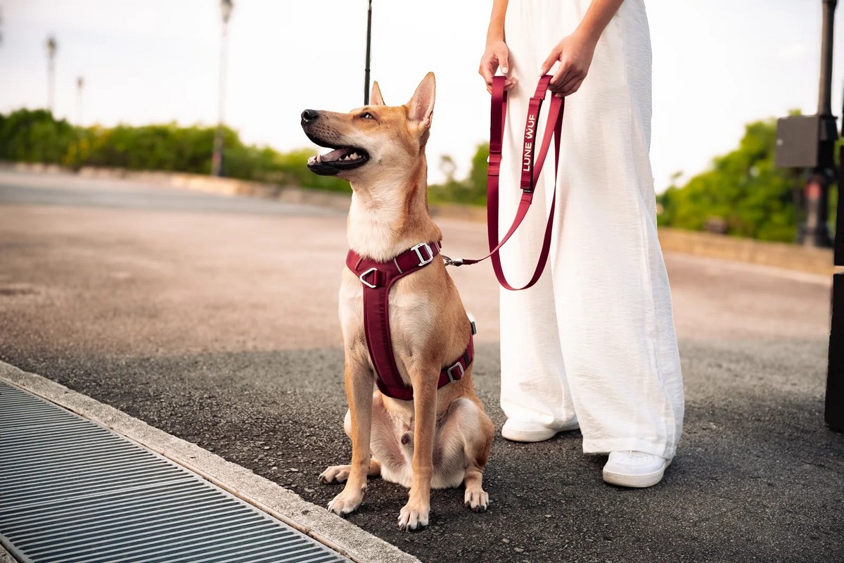
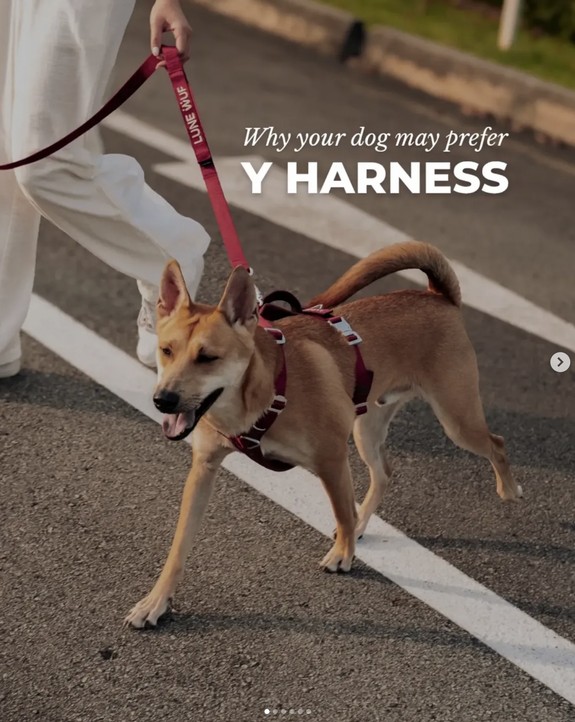
Everyday control
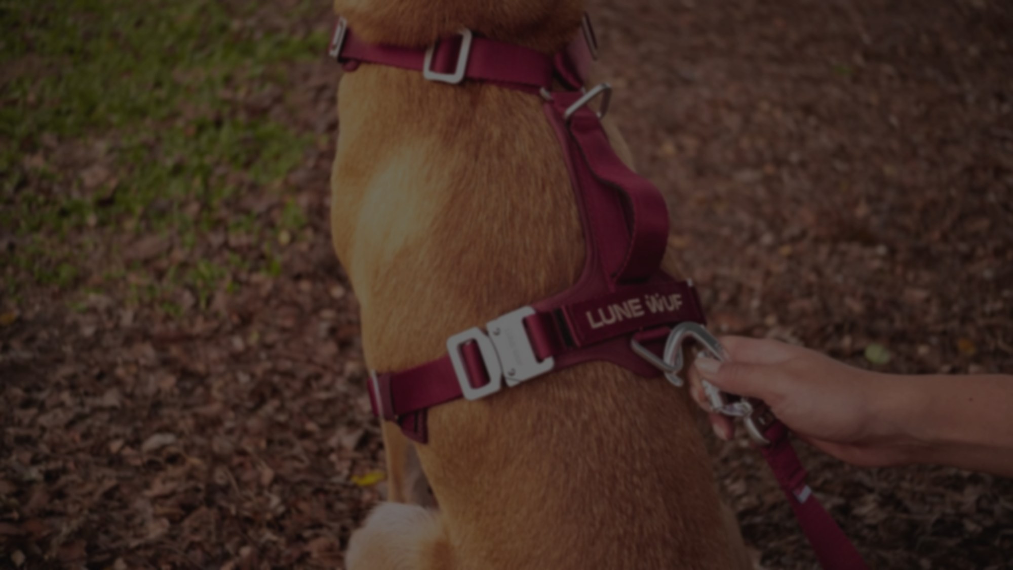
Showing Lune Wuf in a real-world walking context: calm, confident and practical.
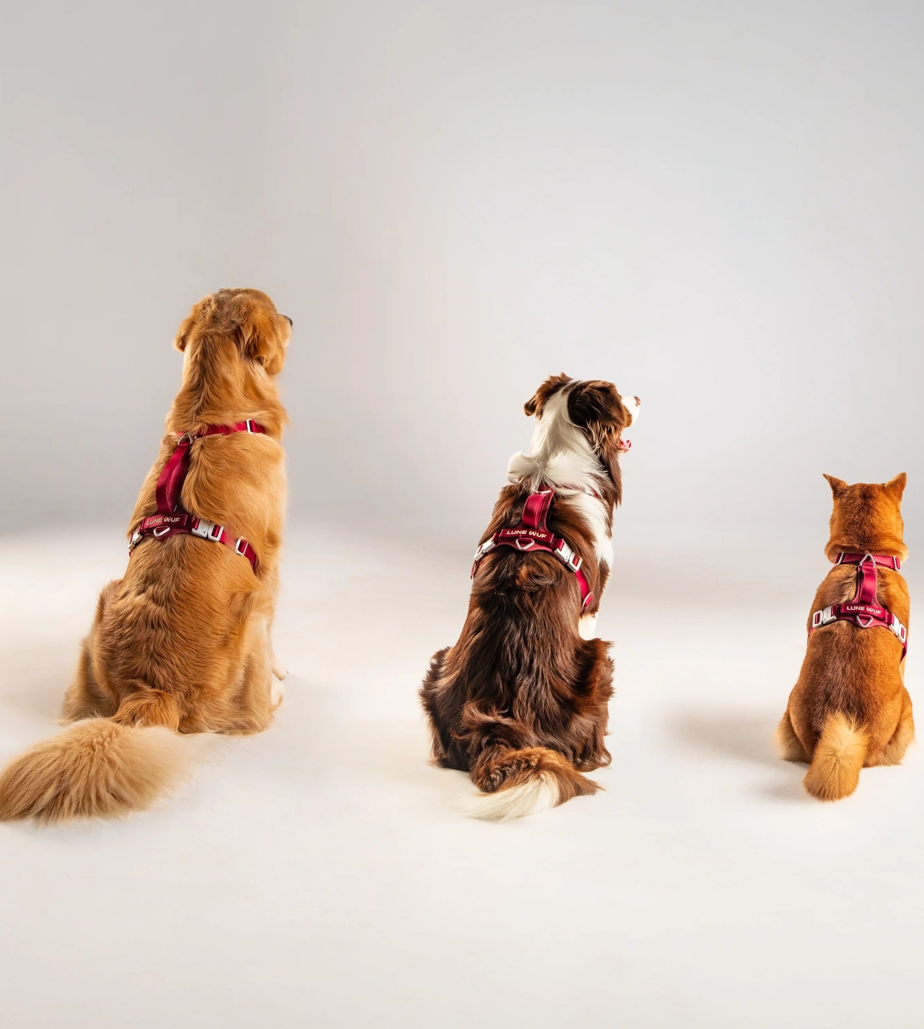
Product detail
Bringing the harness construction and signature hardware into focus without losing the lifestyle feel.
Calm confidence
Capturing the relationship between owner and dog: controlled, connected and effortless.
Five buyer stages, one message each
The five buyer stages were mapped to a message and a content format each, using an awareness ladder.
Awareness
Editorial register for owners who don’t yet know the category has a better answer.
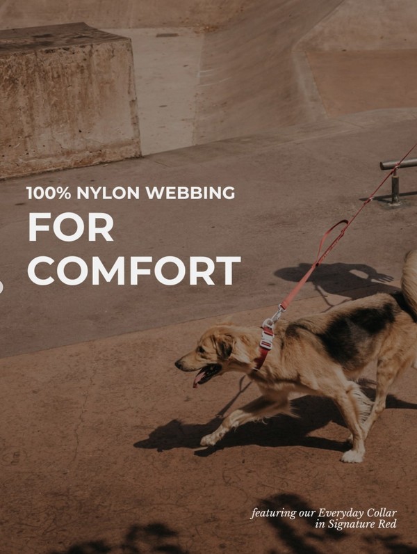
Consideration
Material as benefit: comfort argued from construction.
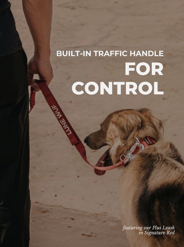
Decision
A single feature doing a single job: the traffic handle, for control.
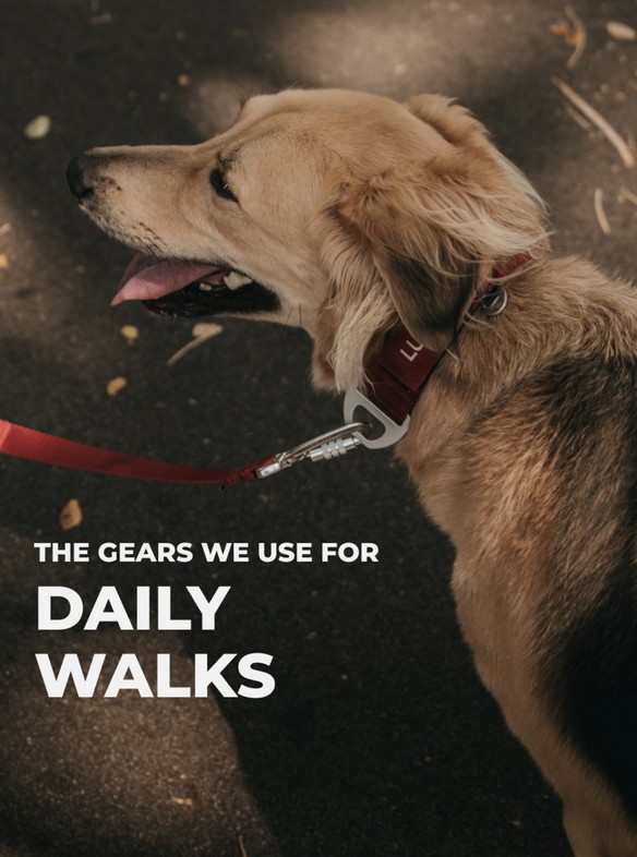
Real life
Putting the product into the moments it was designed for: calm, everyday walks.
What it did
The system shipped
Positioning, vocabulary and visual language are live on the brand’s own site and social.
The proof is third-party
The 430kgf figure comes from an independent SGS test, not from marketing.
The operating picture
- Engagement
- Four workstreams, fixed scope
- Timeline
- Roughly seven weeks, Jan to Mar 2026
- Worked with
- Founder of Lune Wuf
- Team
- Founder and co-founder, photographer, social media manager
Why it mattered
Lune Wuf had already engineered something worth trusting. The work was giving it an argument, and a system disciplined enough that the argument survives being handed to someone else.
The only project here where I was hired for the thinking rather than the making. Different muscle, same instinct: find the true thing about the product, then build the structure that keeps everyone telling it.
Packaging design
Structure, graphics and story, from a sneaker box that ships, stores and returns to a heritage chocolate range.
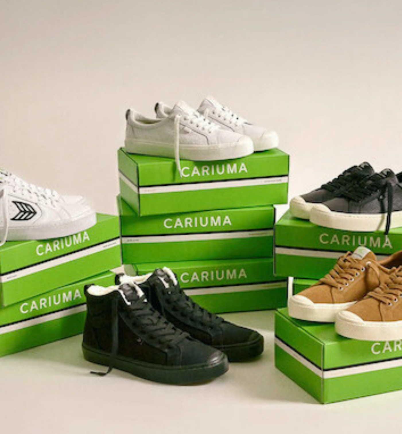
Cariuma Unboxed
One box that ships, stores and returns for adults, and a colour-in box for kids.
Snapshot
- Client
- Cariuma, Rio, Brasil
- Programme
- Direct-to-consumer packaging
- Discipline
- Structural and graphic packaging design
- Scope
- Box, tissue, hang tag, cards, shoe filler, laces
- My role
- Creative Design Director / Packaging Designer
- Owned
- Structure · Graphics · Copy · Sustainability spec
- Range
- Adult 2-in-1 box · Kids colour-in box
Four things to solve
Redefine the unboxing of a direct-to-consumer sneaker brand: less waste, a premium feel, and a version made for kids.
Premium unboxing
Make opening the box feel as good as the shoe.
Less waste
Remove the excess packaging DTC shipping usually adds.
One box, many jobs
Ship, store and return in the same box.
A box for kids
Playful and reusable, with the same sustainability story.
One palette, one leaf
- Brand green · PANTONE 15-0545 TPG
- Cloud Dancer · PANTONE 11-4201 TPG
- Tap Shoe · PANTONE 19-4004 TPG
- Warm Gold · metallic foil
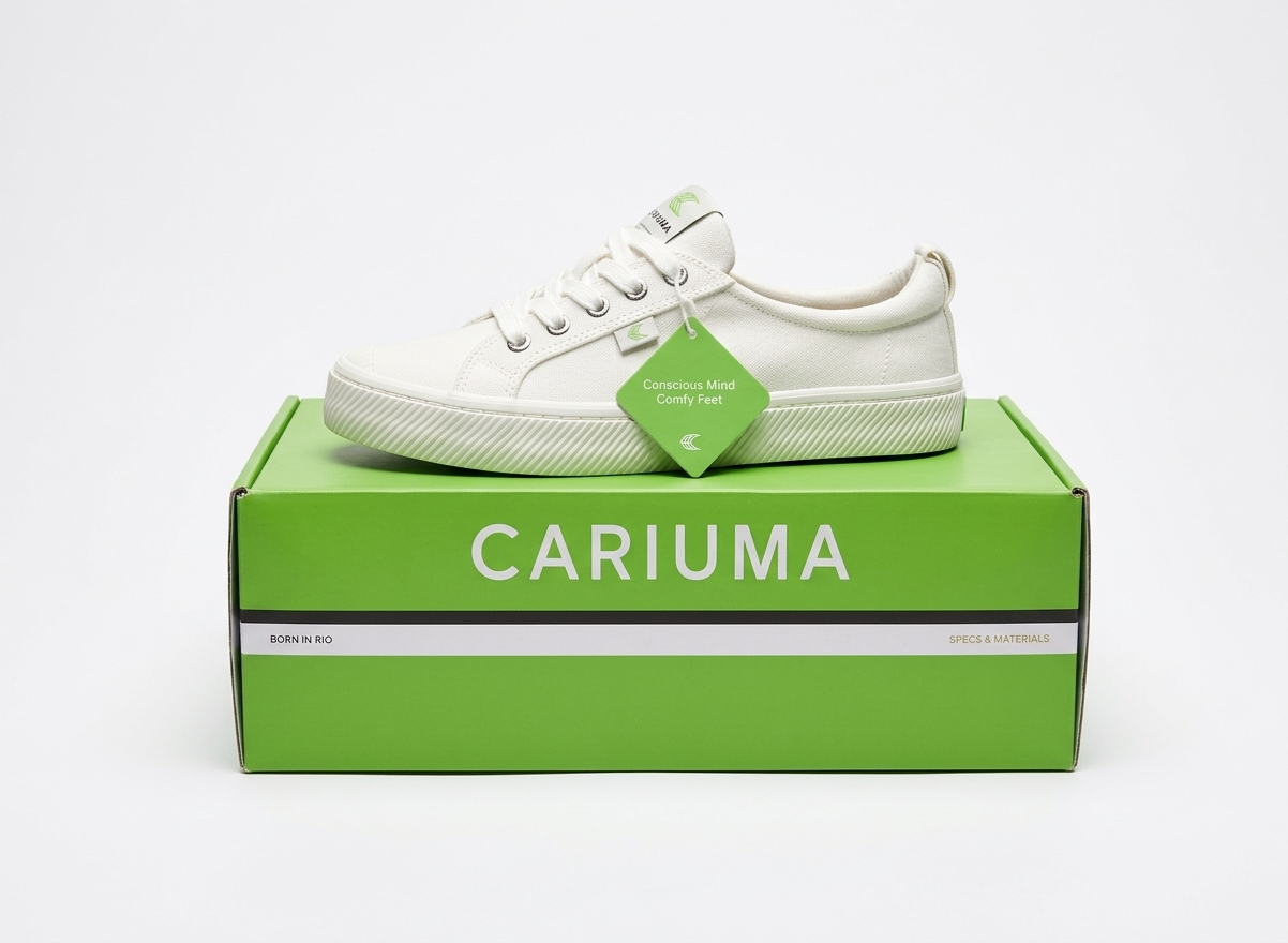
Outside
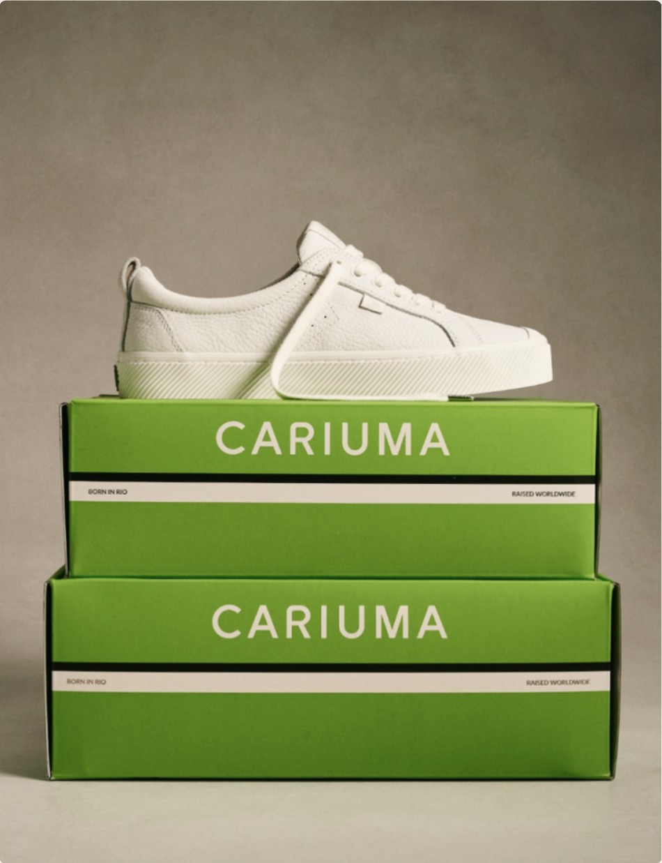
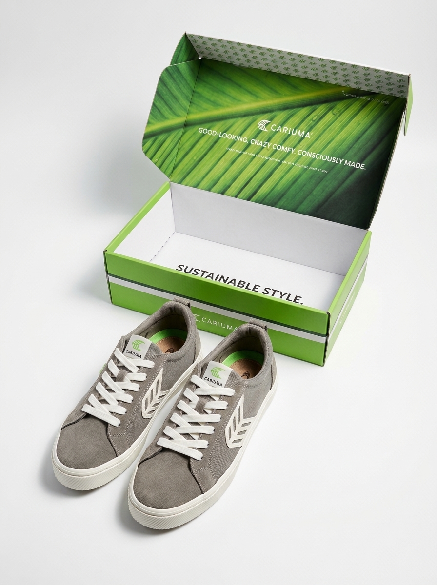
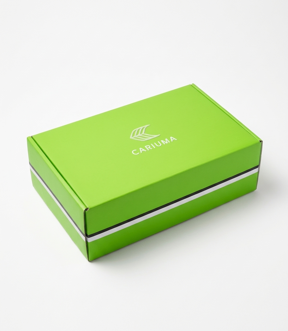
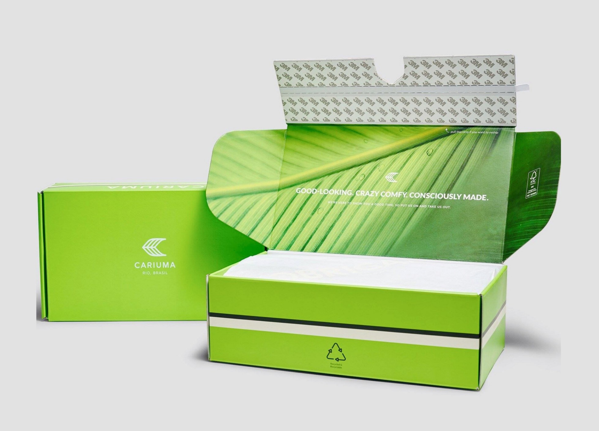
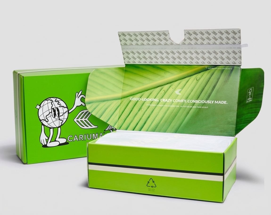
Brand green with a black and off-white stripe, so the box reads from across a room.
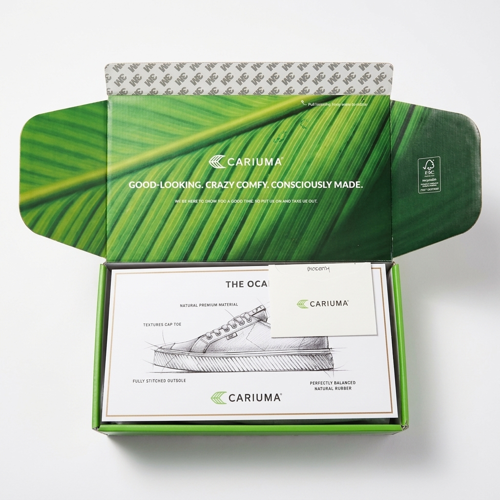
Inside
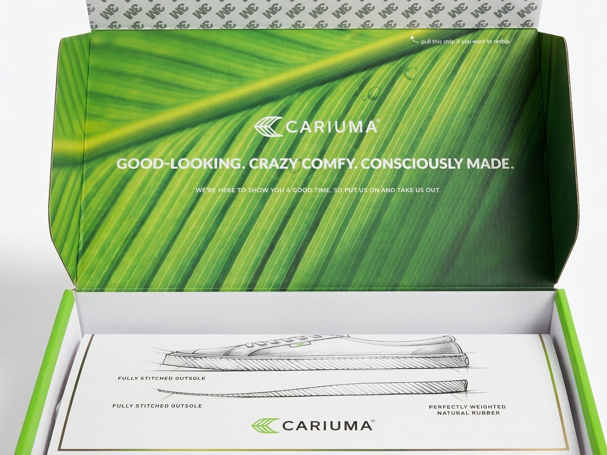
The reveal: a leaf print that carries the sustainability story.
Material
Only recycled and recyclable paper and cardboard, with the FSC recycled mark on the lid.
Two boxes in one
01 Ship
Delivered in one durable, branded box.
02 Store
It stays as the permanent shoebox, with the leaf print inside.
03 Return
An adhesive strip reseals the same box for easy returns.
The unboxing experience
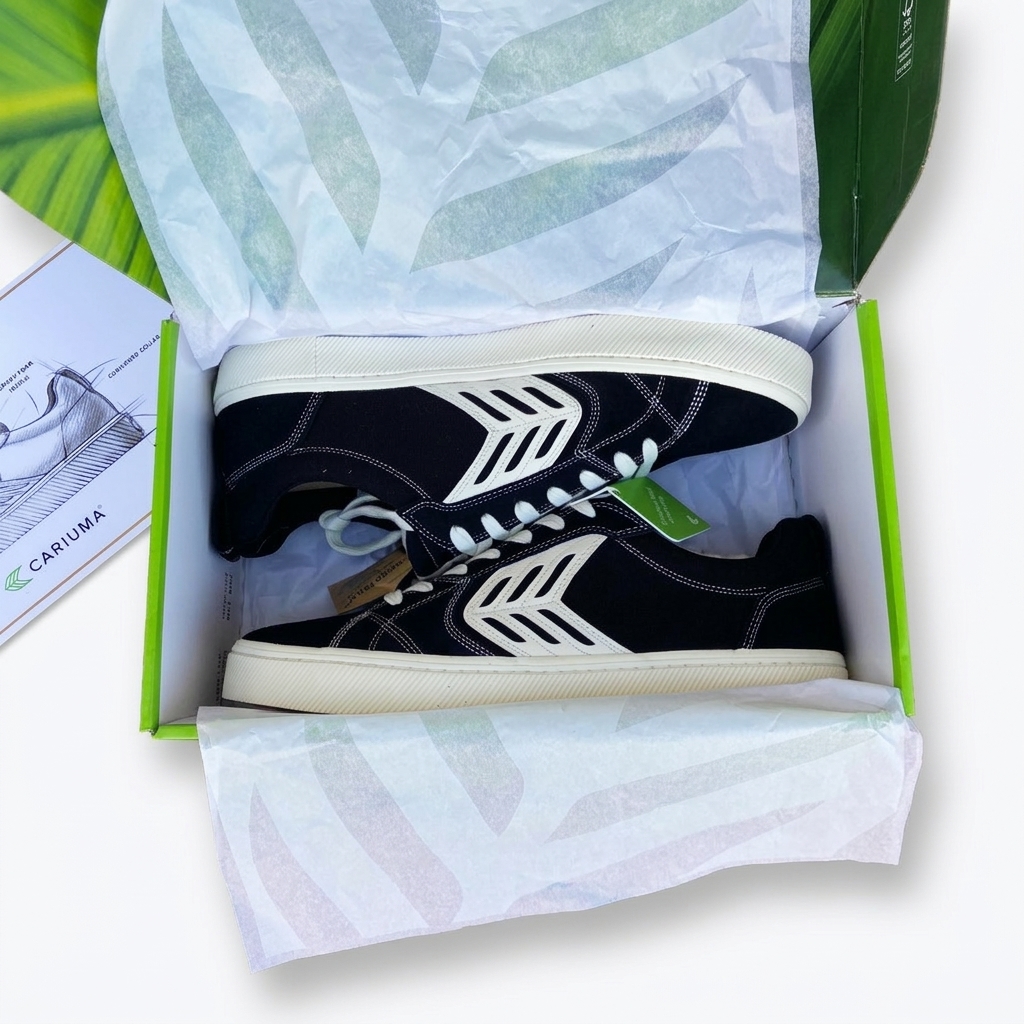
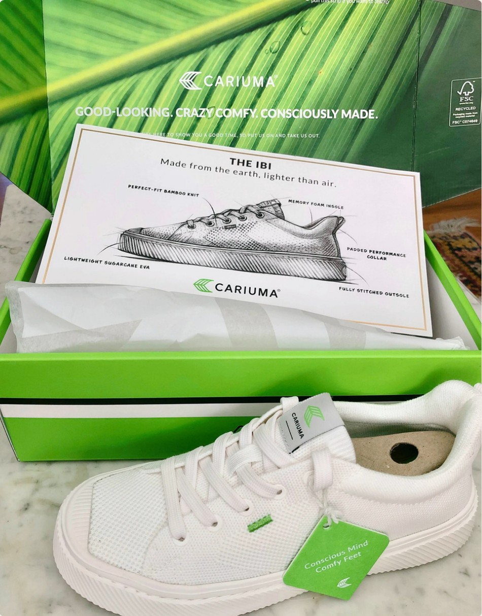
Tissue paper
Branded, so the first thing you see is the logo.
Thank-you card
Personal, and tells you ten trees were planted.
Hang tag
A custom tag on the shoe.
Product card
All you need to know about the product and the brand.
Additional packaging design
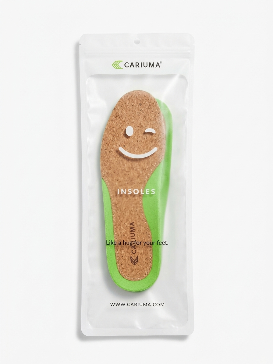
Insole bag
Recycled plastic bag with a minimalistic design, using a transparent window to display the insole.
Gift card
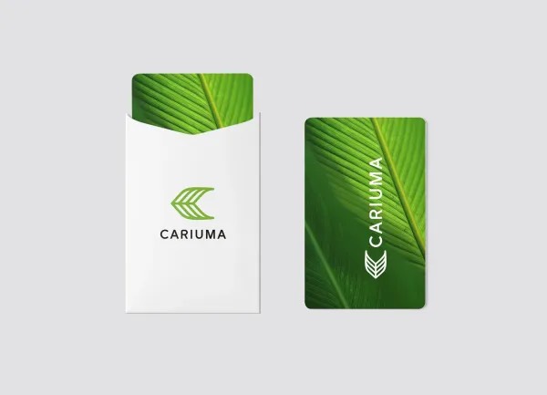
Gift card with an envelope designed for special moments.
Laces
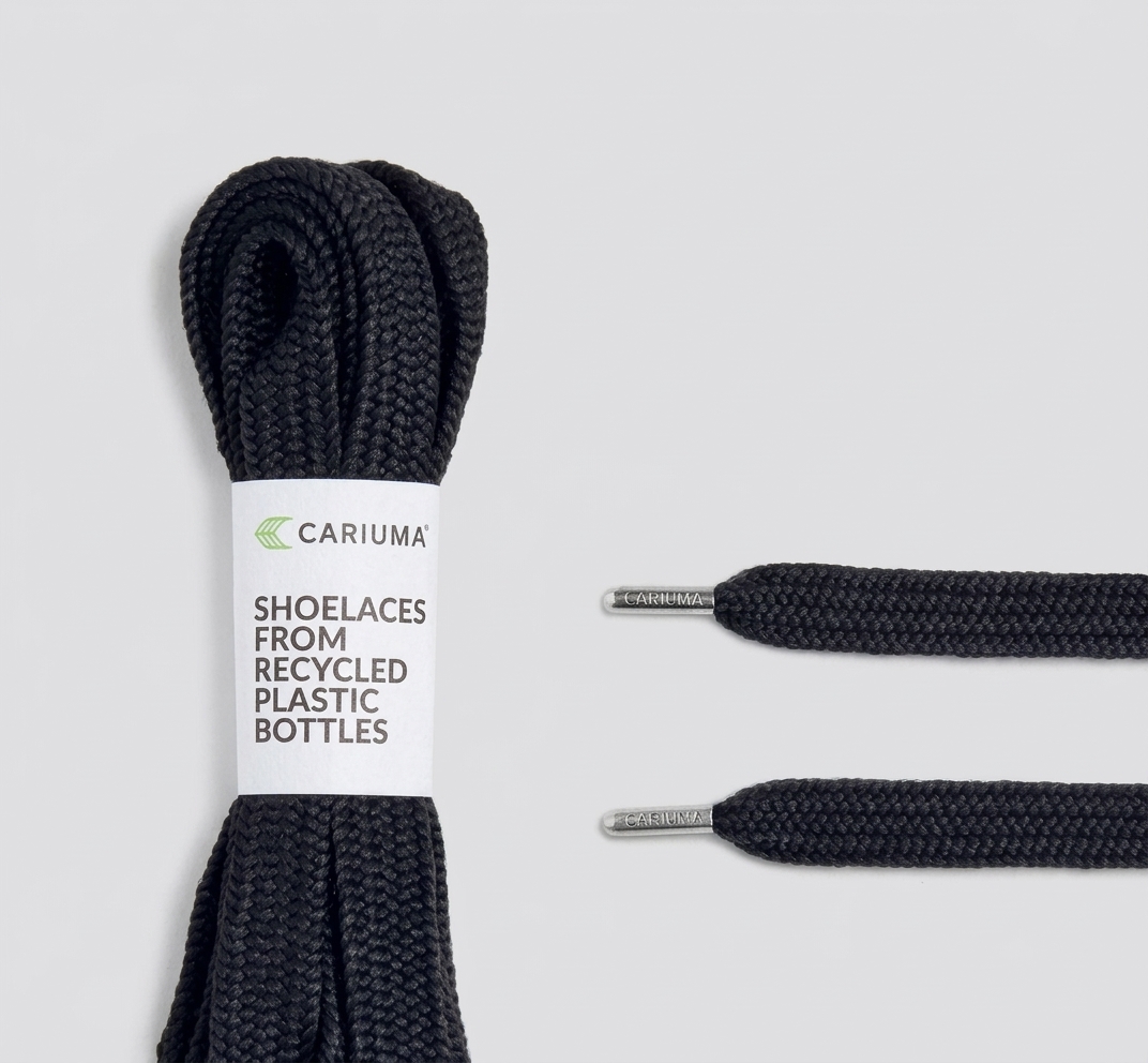
Recycled shoelaces made from plastic bottles, wrapped in a paper band with the Cariuma Rio, Brasil mark. Silver tips carry the name.
T-shirt hangtag
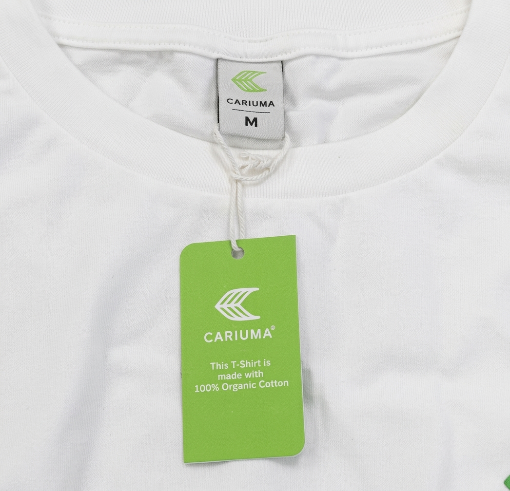
Recycled and recyclable paper in brand colour with key information about the product.
Packaging for children
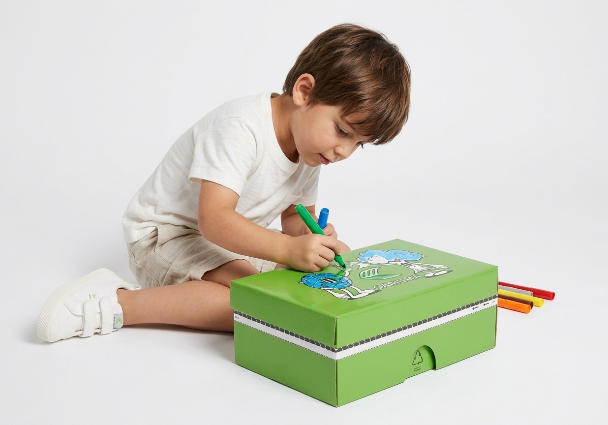
The packaging became more than a box: it turns into a reusable, creative object that encourages play and emotional connection with the brand. It supports sustainability not only through materials, but through behaviour, by extending the life of the packaging and making it meaningful to keep.
Project goal
An engaging experience for kids that extends the product journey beyond purchase and carries the sustainability message in a playful way.
Approach
A box that kids can colour and personalise. Simple, bold, story-driven graphics, with nature-inspired characters. A more immersive world inside.
Result
More than a box: a reusable, creative object that is worth keeping, which extends its life.
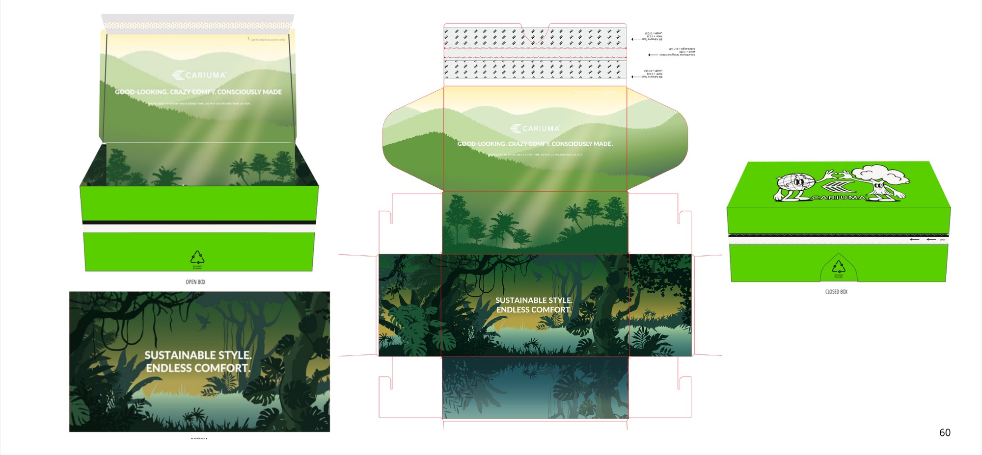
From dark jungle to playful light
First option
A deep rainforest with two characters on the lid. Rich, but dark and quiet for a child.
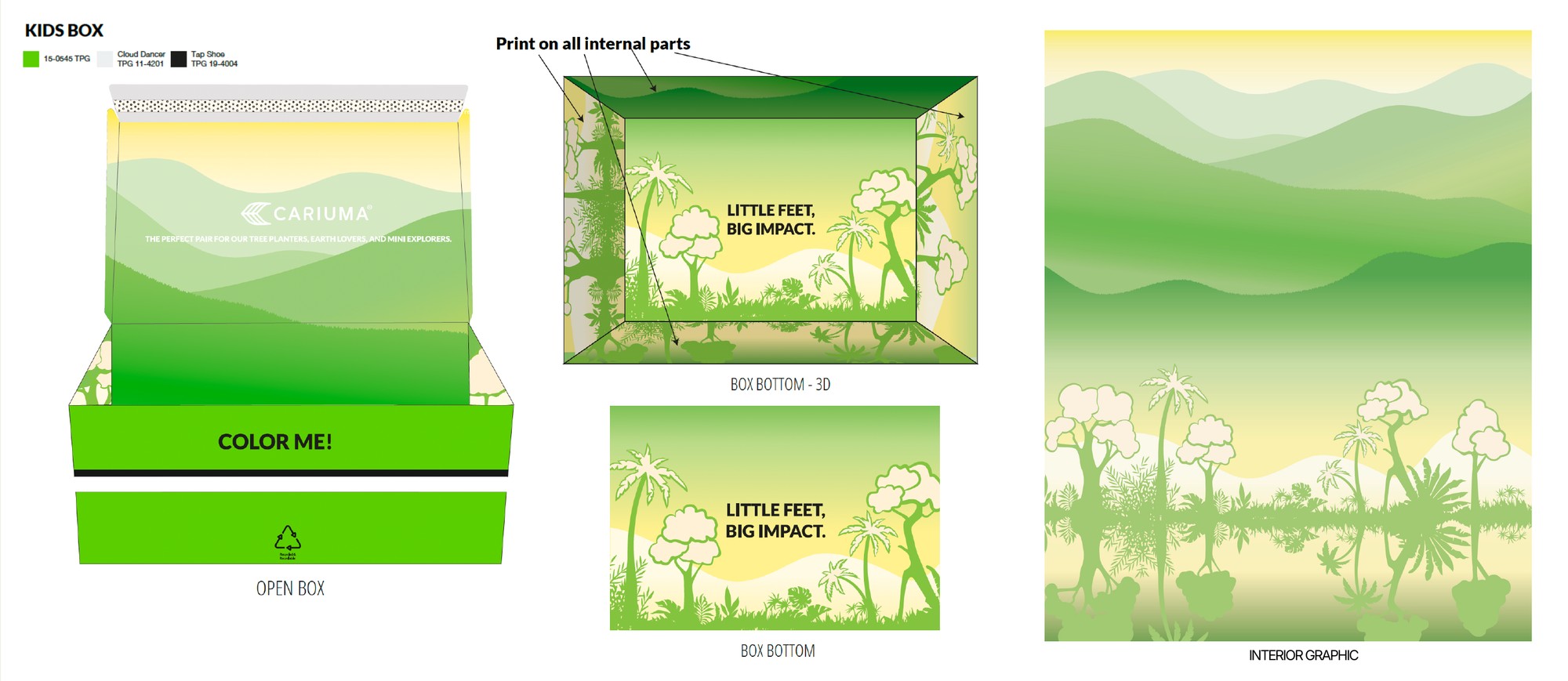
Final
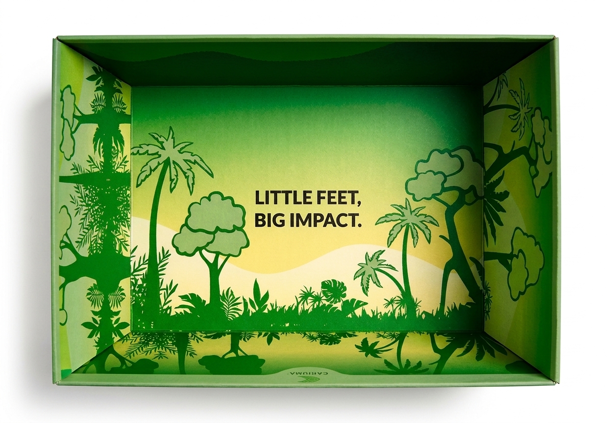
Lighter, brighter and softer. “Color me!” on the front and “Little feet, big impact.” inside.
Details that matter
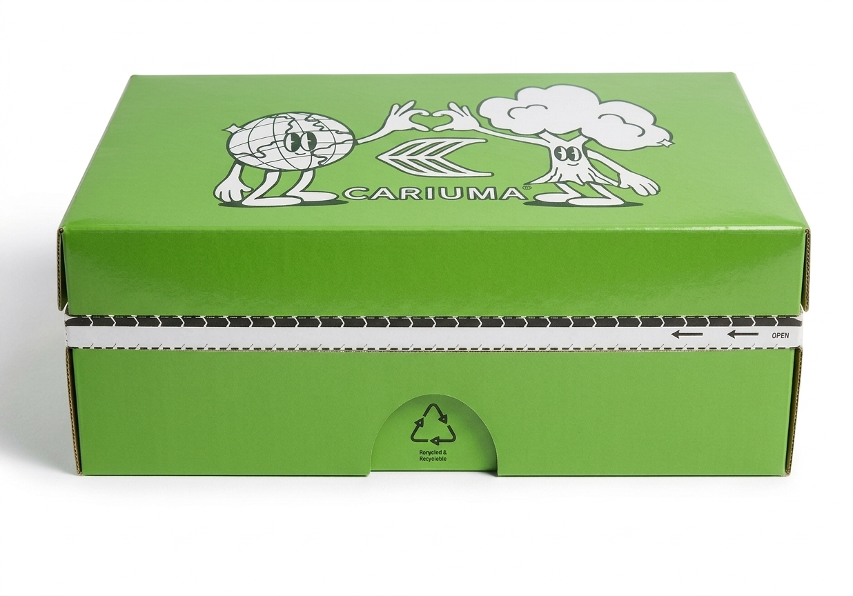
Box exterior
Cariuma’s signature green, featuring playful characters that children can colour and personalise, making each box a creative experience.
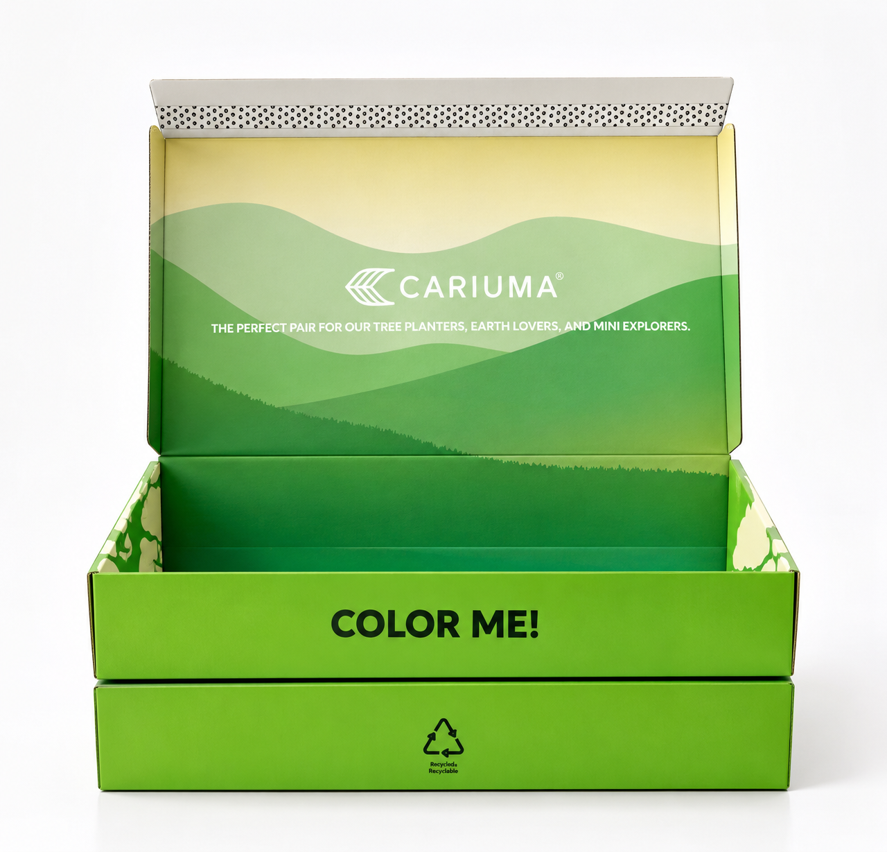
Open box
Opening the box reveals an illustrated Brazilian rainforest, transforming the unboxing into an immersive journey of discovery and exploration.
Box interior
A short, inspiring message that connects children with nature and introduces the importance of sustainability, encouraging them to care for the planet from an early age.
Why it mattered
One box now does the work of three, and a second box turns packaging into play.
Both use recycled, recyclable paper and cardboard, and carry the sustainability story from first look to return.
Berries in Chocolate
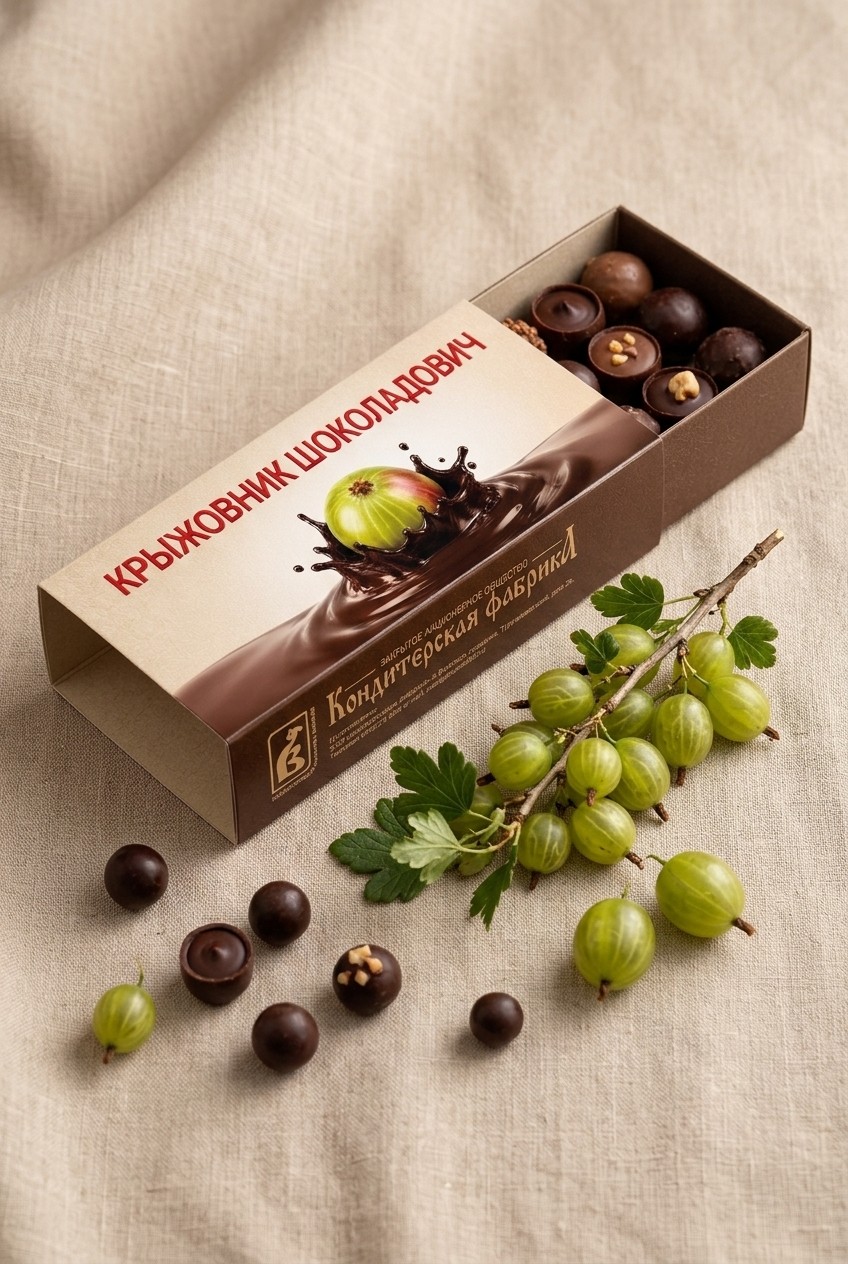
Translating a Vologda confectioner’s heritage into a premium, shelf-ready packaging range.
Snapshot
- Client
- Konditerskaya Fabrika, Vologda, Russia
- Programme
- Chocolate-glazed berry dragées, 50 g
- Discipline
- Packaging design · Colour & finish
- Scope
- Concept routes through to final range artwork
- My role
- Creative Design Director
- Owned
- Direction · Colour system · Pack design · Artwork
- Range
- Five berry flavours on one pack system
Four things to solve
Turn chocolate-glazed berries from a heritage confectioner into a premium, gift-worthy range that is easy to shop and ready for press.
Heritage, made premium
Lift a trusted regional brand without losing its roots.
One system, many flavours
Every berry needs its own identity inside one family.
Print reality
A gold-foil version, and a standard-print version for tighter budgets.
Pack information
Ingredients, nutrition, marks and barcode must sit cleanly in the design.
Classic elegance
Inspired by nature. Made for pleasure.
- Tradition
- Elegance
- Warmth
- Taste
- Harmony
- Quality
Visual approach
Warm, deep colour palette · Classic typography, modern reading · Texture and fine detail · Light, nostalgic illustration · Focus on quality and origin
Effect
Trust and a premium feel · Nostalgia: “like before, but better” · Works for gifting
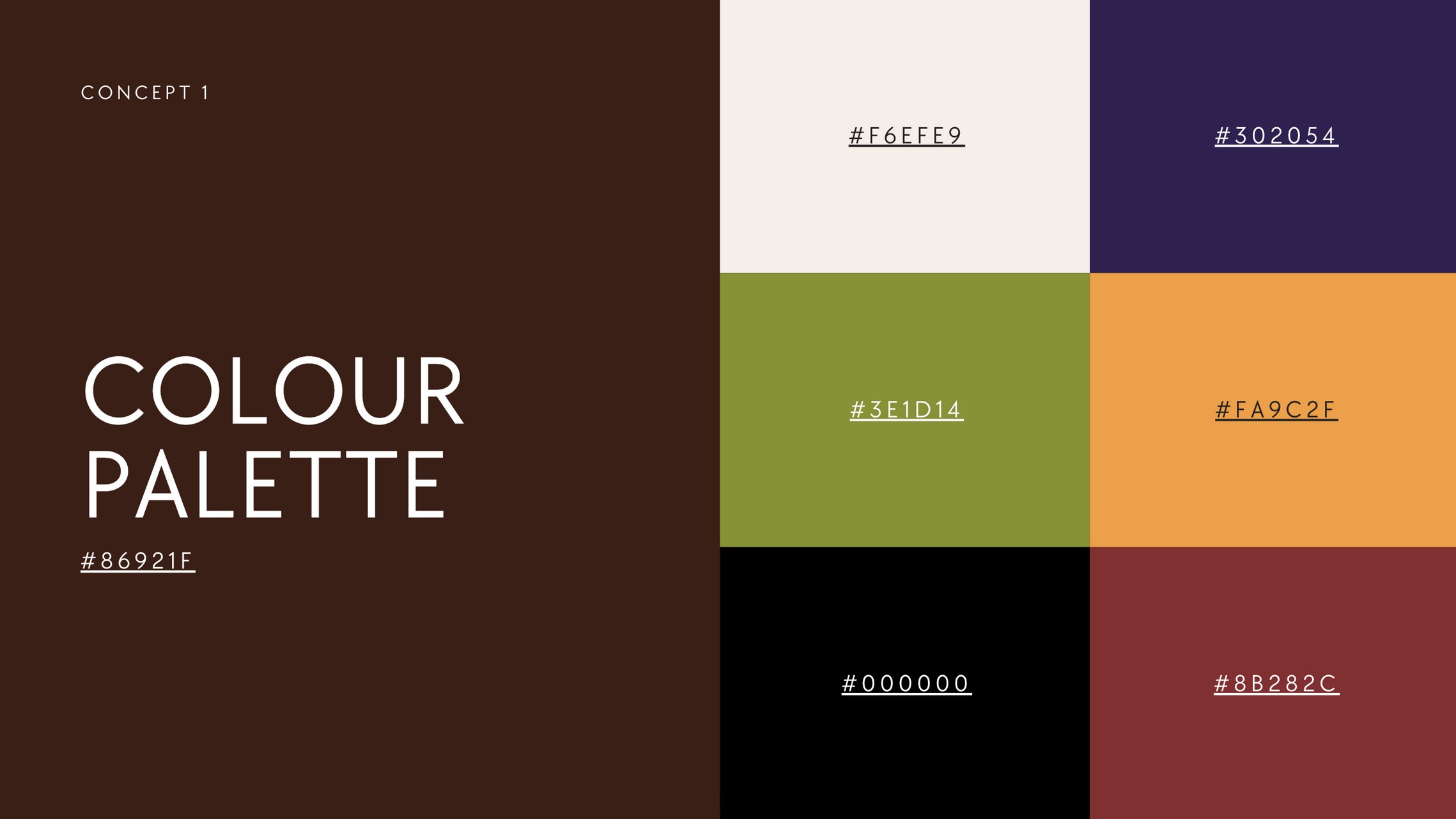
One palette, two roles
- Chocolate #3E1D14
- Cream #F6EFE9
- Black #000000
Constants
Chocolate and cream carry the brand on every pack.
Flavour accents
One accent per berry, chosen to contrast the fruit so each flavour reads from across the aisle.
Finish
Gold foil on names where budget allows, standard print as the fallback.
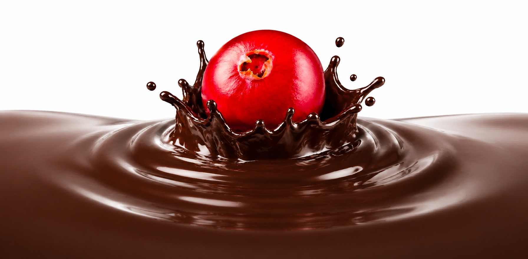
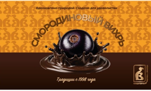
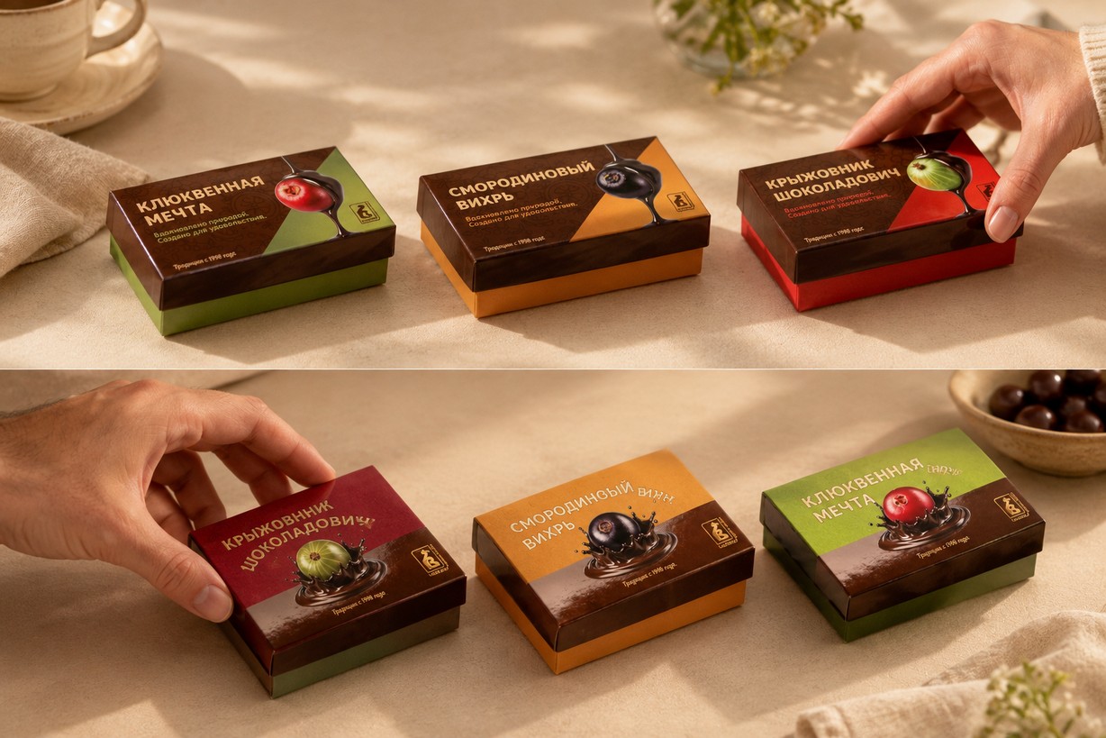
The Berry meets Chocolate
Tradition · Taste · Quality
Two ways to tell the story
01 Fusion of Flavour
Classic and balanced. A horizontal split and the moment a berry drops into chocolate.
02 In the Flow of Flavour
Dynamic and modern. A diagonal split, flowing chocolate and bold colour for shelf impact.



Colour that contrasts the fruit
01 Fusion of Flavour · selected
Matte and glossy finishes create a refined contrast, complemented by gold-embossed lettering and logo. Colourful yet elegant, balancing richness with sophistication.
02 In the Flow of Flavour
A dynamic design combining matte textures and glossy print to create a sense of movement and visual impact, finished with elegant gold-foil embossing for a premium look.
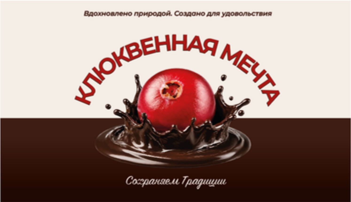
Client feedback, built in
Design note: a large white area can feel empty. It works best on matte, heavy or textured paper, so I explored ways to make the white work harder.
01
Tagline “Fusion of Flavour” replaces “Healthy and tasty”
02
Pattern from the logo removed
03
Top section changed to white
04
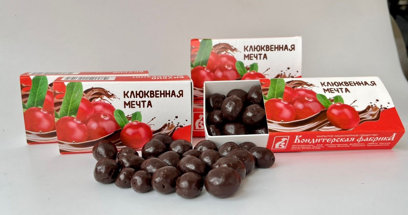
“Cranberry Dream” set in red
05
Logo removed from the bottom right
06
“Preserving traditions” replaces “Traditions since 1998”
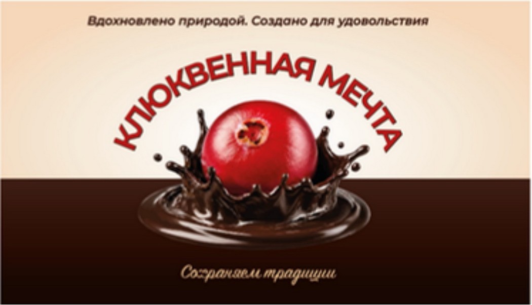
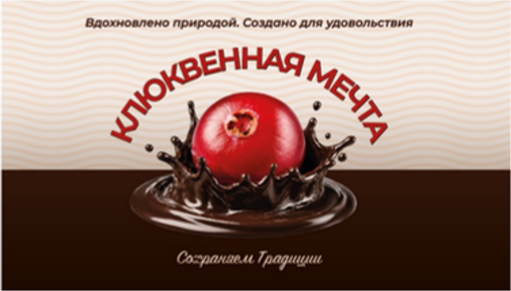
Four ways to treat the white
Round two removed the pattern and the colour. I tested four treatments to give the white top real presence without crowding the pack.
01 Gradient · selected
Focus on the berry.
02 Traditional pattern
A nod to the factory’s origin.
03 Wave lines
Simple geometric graphic.
04 Dot pattern
Simple geometric graphic.


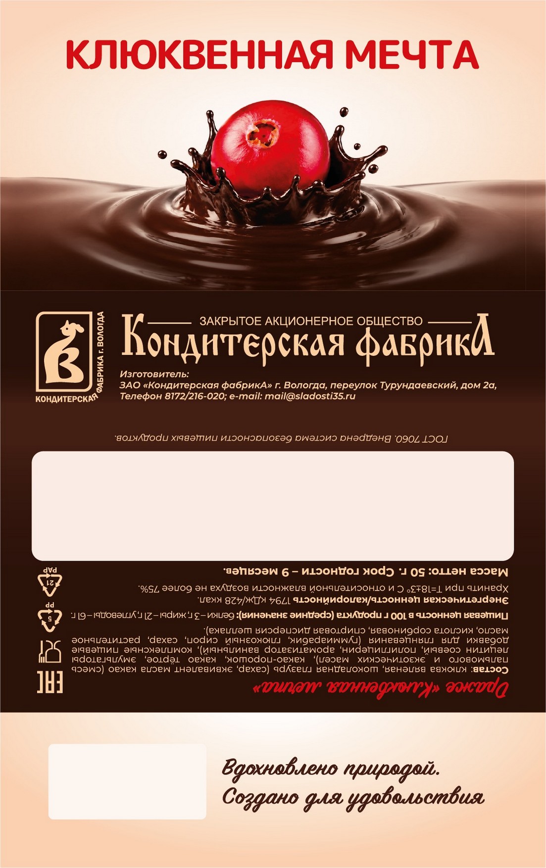
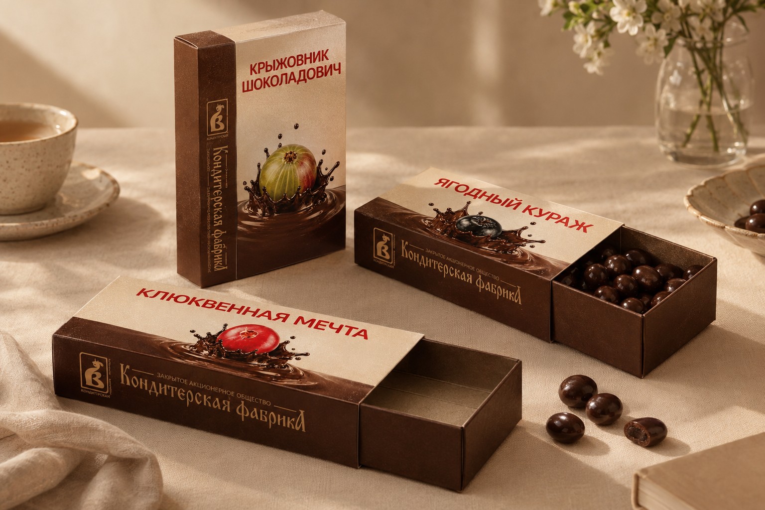
One system, five flavours
One grid, one hierarchy. Only the berry, the name and the information panel change.
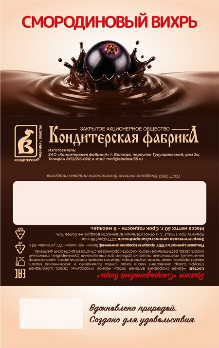
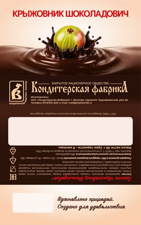
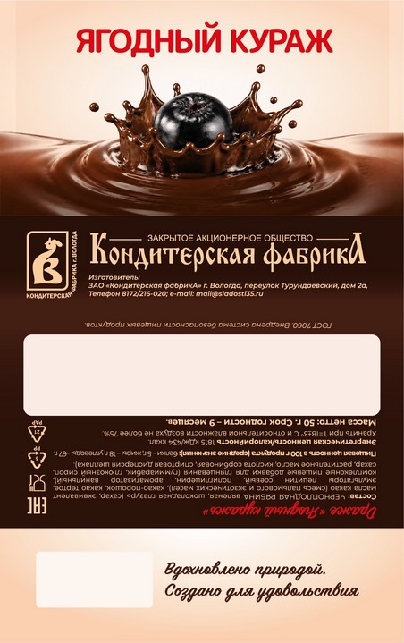
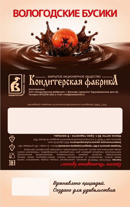
Horizontal and vertical options
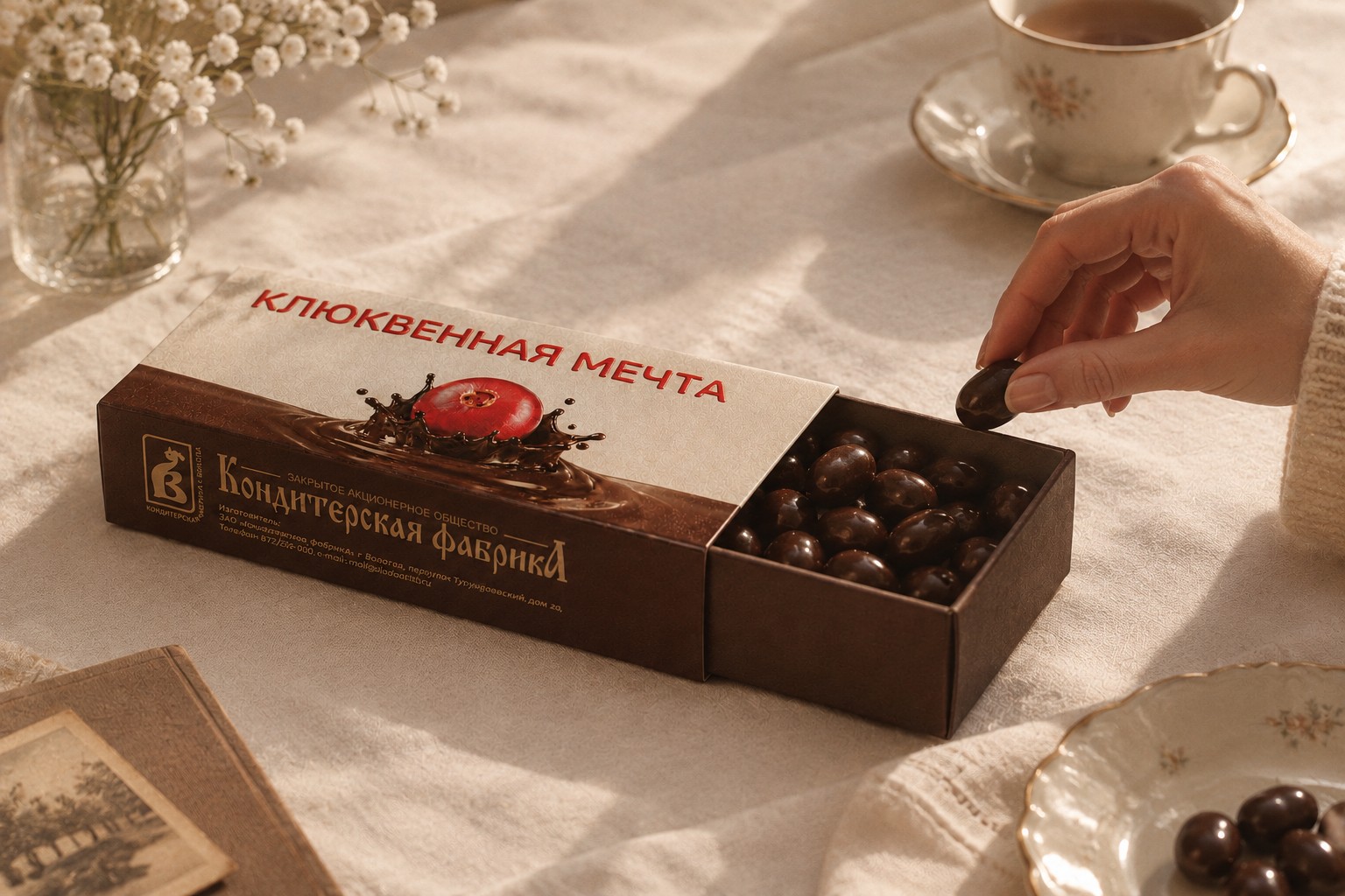
Pack to shelf, without drift
01 Hero
The berry and chocolate splash, with the flavour name in red.
02 Brand band
Logo and wordmark in gold on chocolate, identical on every pack.
03 Information
Ingredients, nutrition, storage and marks in one quiet panel, with a clear box for the date.
04 Signature
The tagline, plus clear space for the barcode.
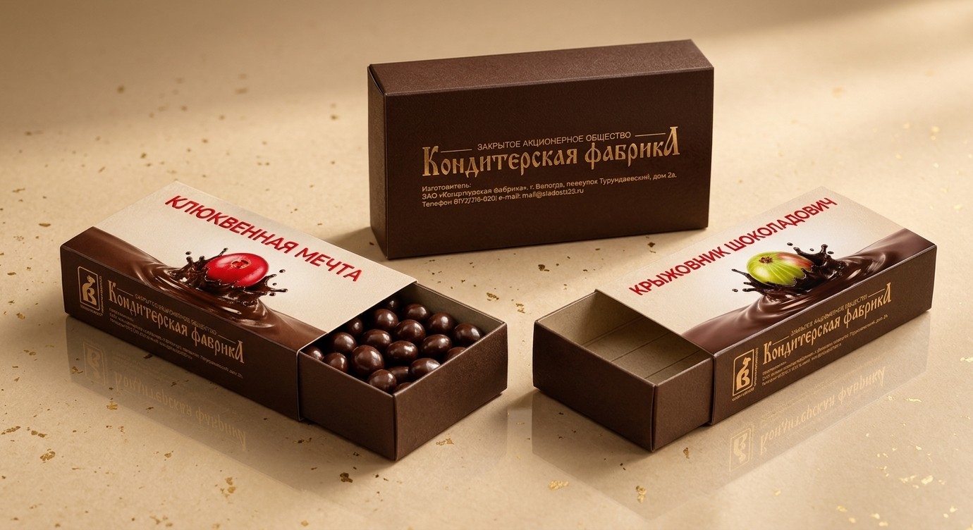
Why it mattered
A regional confectioner now has one packaging system that feels premium, keeps its heritage visible and tells a single story across five flavours.
It prints in foil or standard inks, and the same grid can take the next berry.
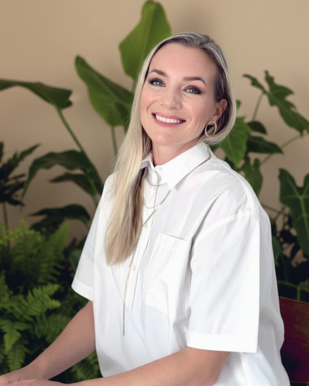
Hello,
I’m Arina.
Design doesn’t just shape products, it shapes perception.
I’m a Creative Director who builds brand worlds people want to step into. I started in industrial design, spent six years inside adidas learning how colour, material and story become product, then helped grow Cariuma from a start-up into a global brand, with partnerships from Disney and National Geographic to Avatar, Star Wars and the Olympic Games.
What I care about is the moment someone feels a brand was made for them. So I start with how customers live, think and choose, then build the idea, the story and the craft around it, across campaign, product, packaging, retail and digital.
Today I run DesignStep in Singapore, leading brand and creative work for clients across Europe, Asia and Canada, and teaching creative direction and design psychology to teams and students, including at LASALLE College of the Arts. I’m open to Creative Director roles with agencies and brand-side studios.
- Based in
- Singapore
- Experience
- 14+ years across fashion, sport, lifestyle and entertainment partnerships
- Previously
- Cariuma, Creative Design Director · adidas, Senior Designer
- Now
- DesignStep, Founder and Creative Director
- Speaks
- English, German, Russian
Workshops
& teaching
Through DesignStep I run workshops for design teams, brands and students, including at LASALLE College of the Arts, and speak on creative strategy, design psychology and brand storytelling in Russia, Germany and Singapore.
Master the art of color and material
Discover how to use color psychology and material innovation to craft standout products.
View details ↗Sustainable design practices
Design with purpose. Create with impact.
View details ↗Customer-centric thinking
Put your customer at the heart of every design.
View details ↗Successful storytelling in design
Design with a story. Connect with purpose.
View details ↗DesignStep also offers brand building and strategy, brand identity books, colour and material collection design, footwear design, and consulting sessions from discovery calls to design career consultations.
See all services and book ↗Curriculum vitae
Profile
Creative Director with 14+ years of turning brand ideas into campaigns that work across categories, audiences and channels. My background spans fashion, sport, lifestyle and any type of physical product brands, and the method stays the same for every brief and scope: find the human insight, build the story, and carry it through digital, retail, packaging and PR so the brand feels like one thing everywhere.
Open to Creative Director roles in agencies and brand-side studios.
Capabilities
- Creative direction
- Campaign concepts and storytelling
- Brand collaborations
- Brand identity and positioning
- Launches and activations
- Digital and e-commerce
- Retail and visual merchandising
- Packaging and unboxing
- Leading creative teams
- Customer insight
- Product, footwear and CMF design
- Workshops and teaching
Education
- BA Product DesignBerlin Weissensee School of Art · 2011 to 2013
- BA Industrial DesignMunich University of Applied Sciences · 2009 to 2011
- Master’s Diploma with Honors, Fine Arts and DesignCherepovets State University, Russia · 2003 to 2008
Tools: Adobe Creative Suite, Figma, Rhino, hand and digital sketching, prototyping.
Languages: English, German, Russian.
Experience
DesignStep, Founder and Creative Director
- Building Seaborn, a kidswear brand, from the ground up for an international client: brand DNA, visual identity, positioning and go-to-market. Launching in Canada in early 2027.
- Create storytelling systems and creative strategies for fashion, lifestyle and sport clients across Europe, Asia and Canada.
- Lead end-to-end creative execution, from concept and content direction to production, ensuring alignment between creative vision, brand goals and market needs.
- Run workshops on customer understanding, design psychology and brand storytelling, including at LASALLE College of the Arts. The DesignStep content platform reaches 40K+ people.
Cariuma, Creative Design Director
- Brand activation lead for the Paris 2024 Olympics: concepts, uniforms and activations for the skateboarding teams of Portugal, Brazil and the Netherlands.
- Directed global brand partnerships including Disney, National Geographic, Star Wars, The Simpsons, Peanuts, PANTONE and Avatar: The Way of Water, covering storytelling, product, packaging, landing pages and retail displays.
- Defined the brand’s visual identity and seasonal narratives across digital, retail and PR, and supported the shift from U.S. direct-to-consumer to international wholesale.
- Led the creative revamp of the e-commerce experience, and directed retail pop-ups, store visual merchandising and wholesale sales materials.
- Rebuilt the packaging and unboxing experience, lifting perceived premium value by 20% and improving customer NPS.
- Led the global design team and the launch of an industry-first bamboo sneaker that sold out in two weeks and built a waiting list of over 20,000.
- Presented and sold seasonal collections to retail partners across Europe and the USA.
adidas, Senior Designer, Footwear and CMF
- Co-developed seasonal narratives that linked product innovation to brand campaigns, including collections involving Selena Gomez.
- Worked with the London-based creative director of adidas by Stella McCartney on a fashion-led performance collection.
- Part of the global Color and Materials team, setting trend research and palettes across categories.
- Presented design concepts and seasonal strategies to leadership and cross-functional partners.